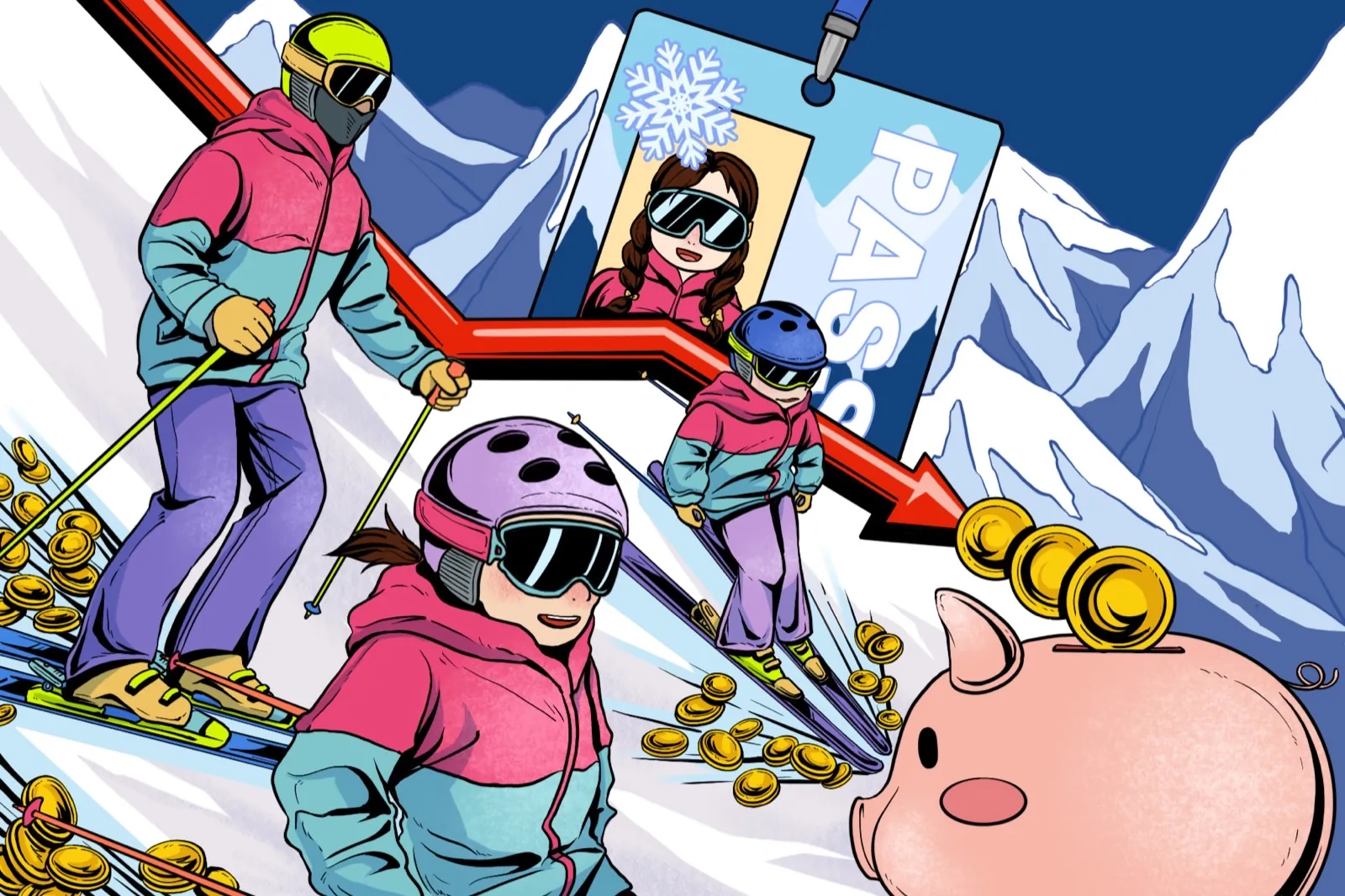
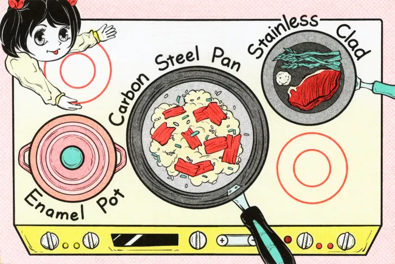
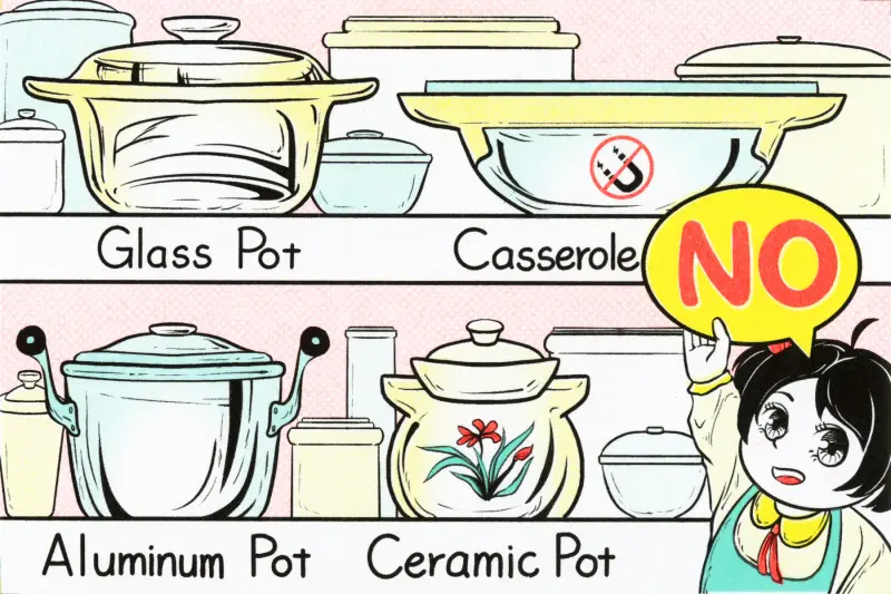
Make Your Day
A tablet-based interactive planning tool that helps children and caregivers co-plan everyday family activities through choice, preparation, and reflection.


A tablet-based interactive planning tool that helps children and caregivers co-plan everyday family activities through choice, preparation, and reflection.
A cooperative board game that helps immigrant-origin children in grades 3–5 practice belonging through peer-to-peer inclusion scenarios in everyday school spaces.
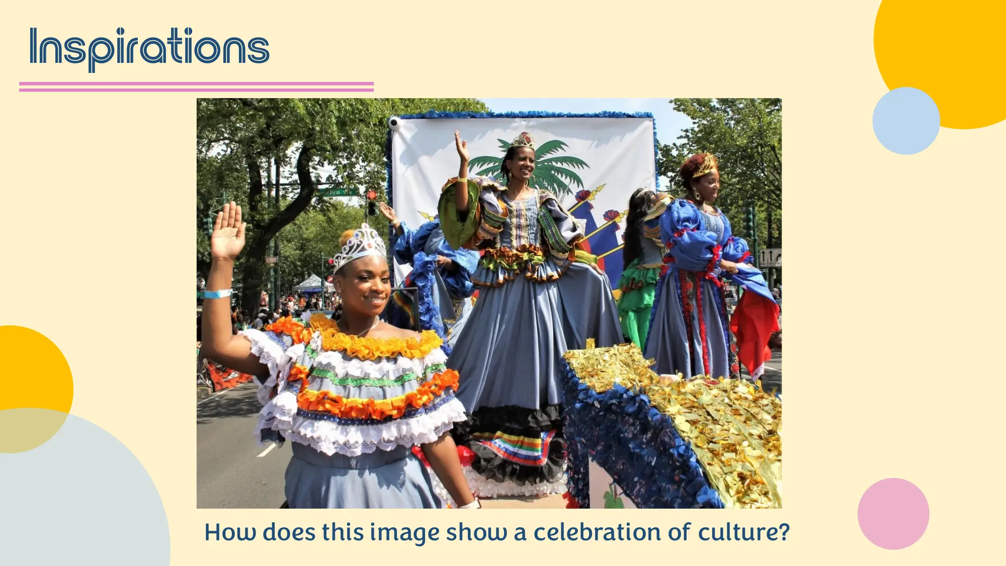
A gallery learning experience at the Harvard Art Museums for Chinese high school students, using artworks as starting points for personal reflection on past, present, and future.
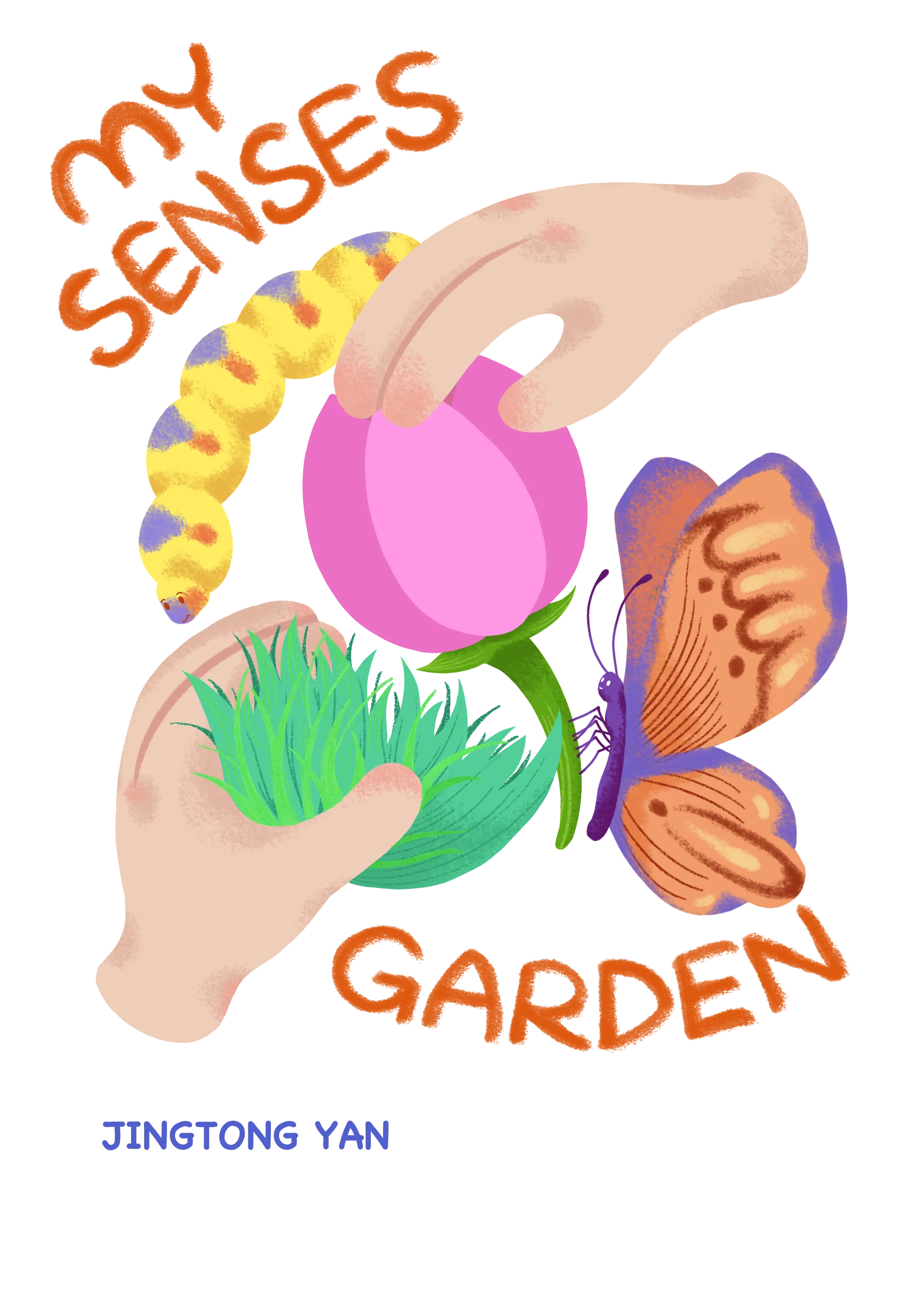
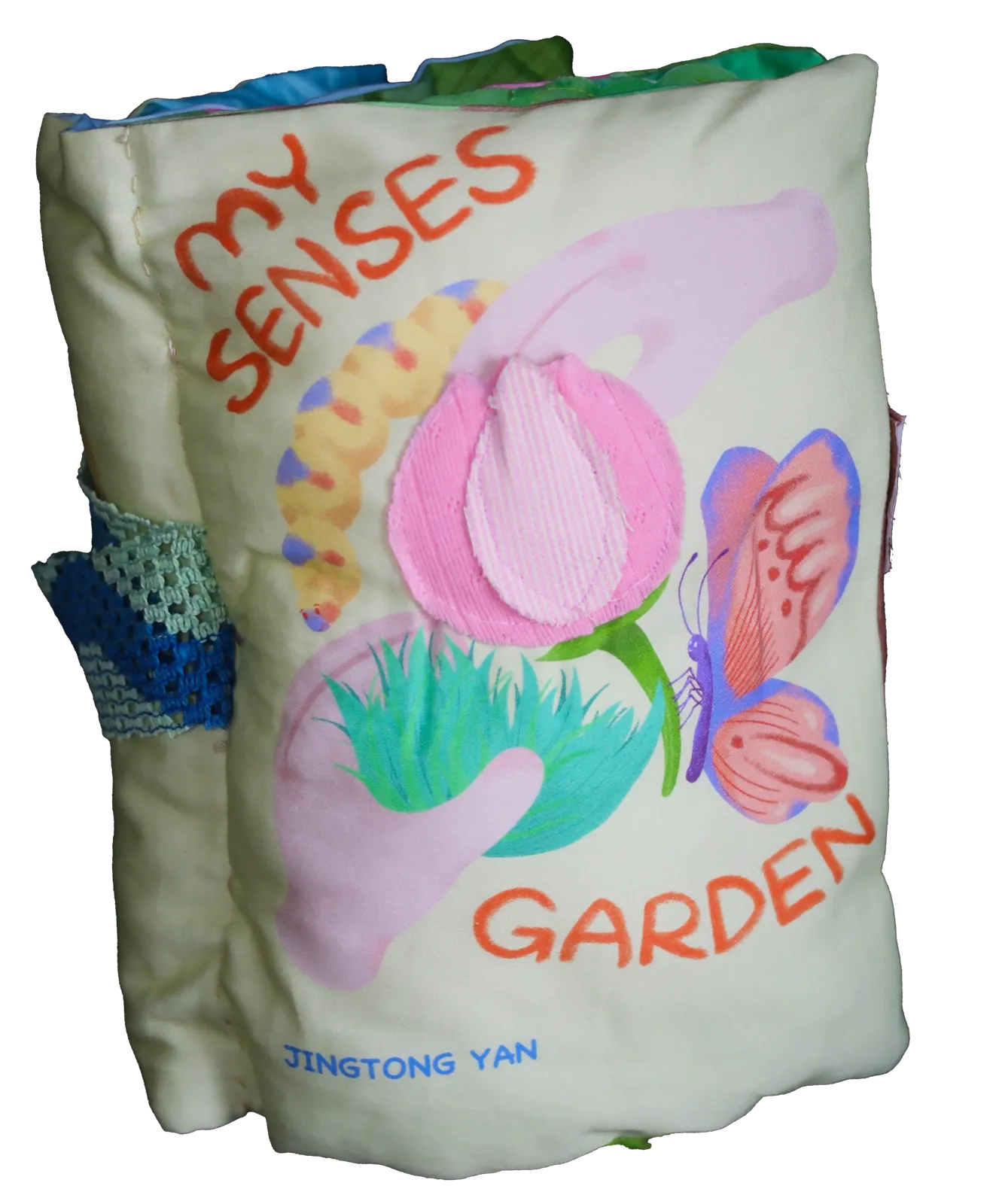
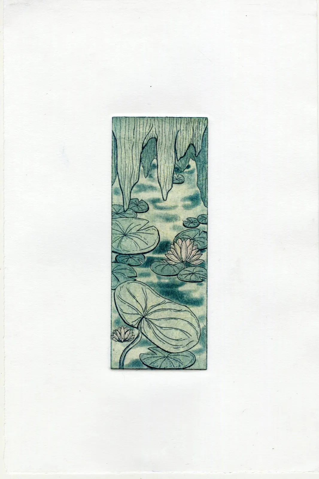
An interactive sensory book that invites readers to explore a "garden" through touch, sound, smell, taste, and sight — turning reading into a shared, hands-on experience.
A 9-week after-school STEAM curriculum that uses hands-on art-making to teach science concepts like surface tension, density, and chemical reactions.
A classroom-based SEL experience that uses short videos and puzzle decision-making to help Chinese first graders navigate the transition from kindergarten to elementary school.
A collaborative mural project with 4th- and 5th-grade students, transforming four stairway doors into a continuous public artwork celebrating school values.
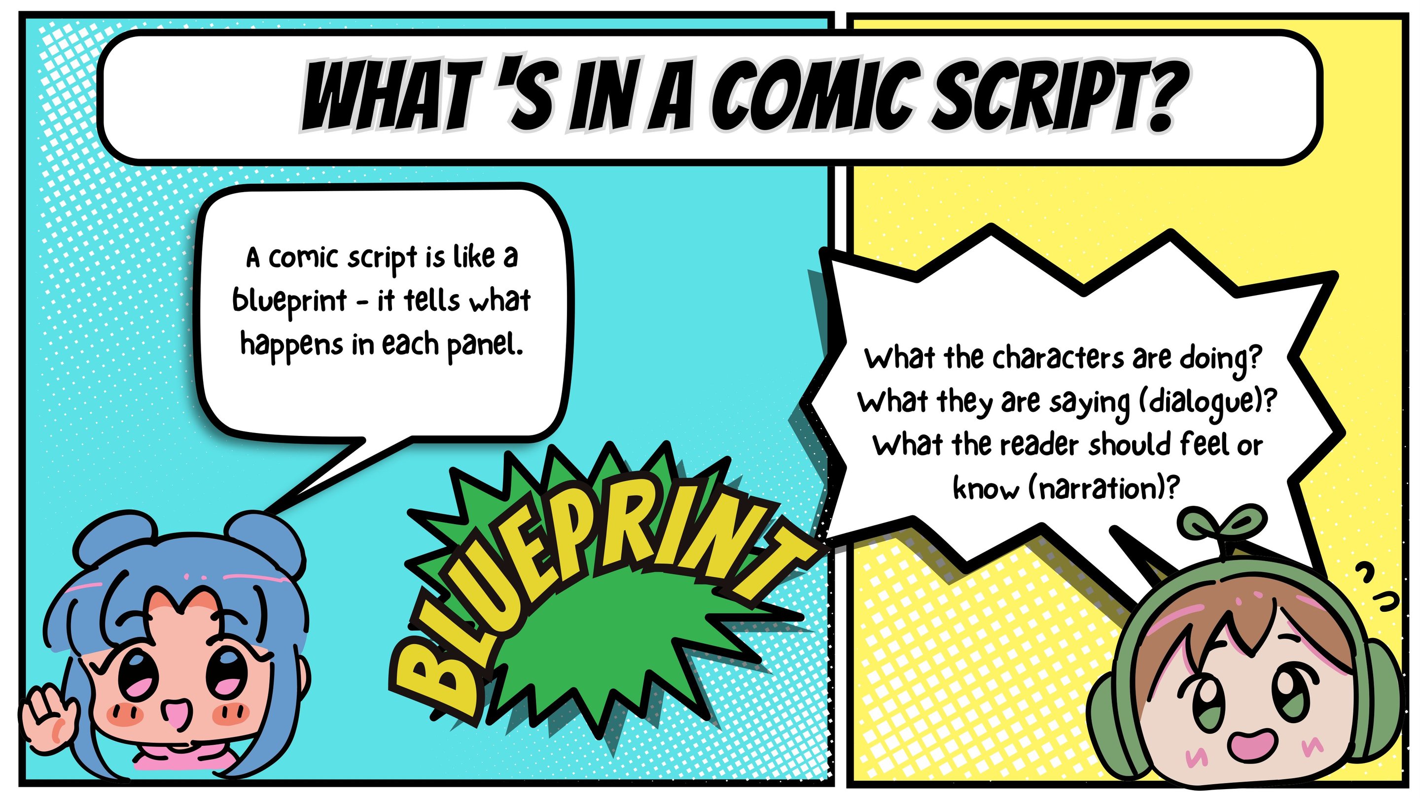
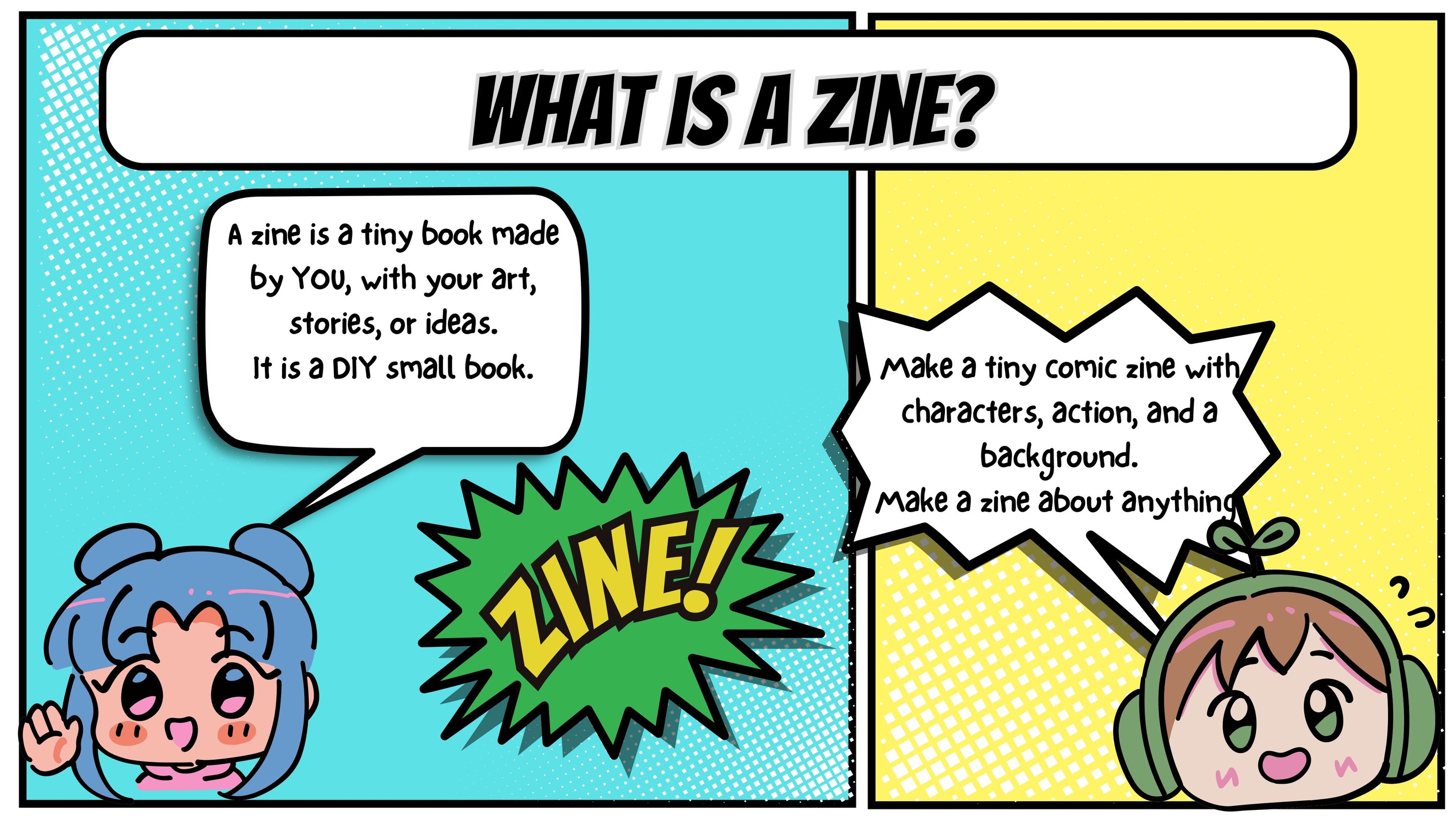
A 10-session comic-making workshop that progressively builds skills from panel layouts to a finished comic through character design, scripting, inking, and collaborative comic jams.
An interactive pop-up book that serves two generations: children explore through play mechanics, grandparents learn through bonus zines.
A studio-based drawing project that helped middle-school students transform a competition prompt about dinner into personal visual narratives rooted in family memory, food traditions, and cultural identity.
A collaborative summer banner project where middle school students imagined a future New York City through the cultures, landmarks, sports, and community values that mattered to them.
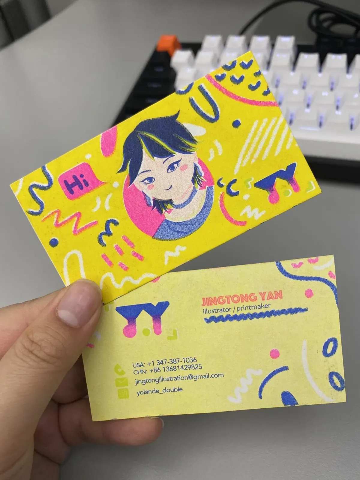
Hi everyone! I'm Jingtong Yan, an illustrator, book artist, and learning designer based in New York City, originally from China. My illustration practice centers on interactive books, including pop-ups, sensory books, and playbooks, alongside editorial illustration and motion work. I create work intended to function across both print and digital media.
My books are designed for children, providing learning experiences through interaction, though they are made to be accessible to all audiences.
As both a teaching artist and curriculum developer, I take a constructionist approach to education, focusing on play-based, informal learning environments where learners develop social-emotional skills through arts-integrated, interdisciplinary practice.
Get in touch: jingtongillustration@gmail.com
EdM Teaching and Teacher Leadership
Arts & Learning Concentration
BFA Illustration
Photography: Unpublished · Shortlist
New Talent: Publishing · Shortlist
Chosen
Student Competition · Winner
New Talent · Merit Award
Illustration: Student · Winner
Illustration: Student · Runner-Up
Uncommissioned · Finalists
Student Show · Honorable Mention
Cambridge
New York
Hangzhou
London and Athens
New York
New York
New York
Shanghai
Shanghai
3x3 Magazine
The Visual Arts Press
Foreign Languages Press
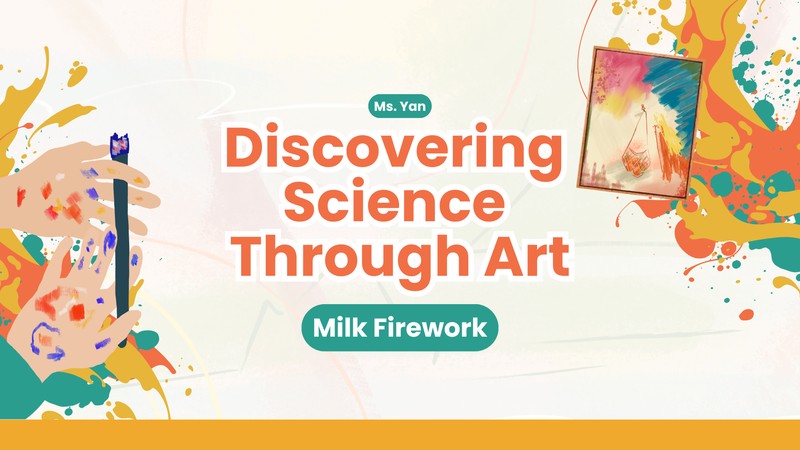
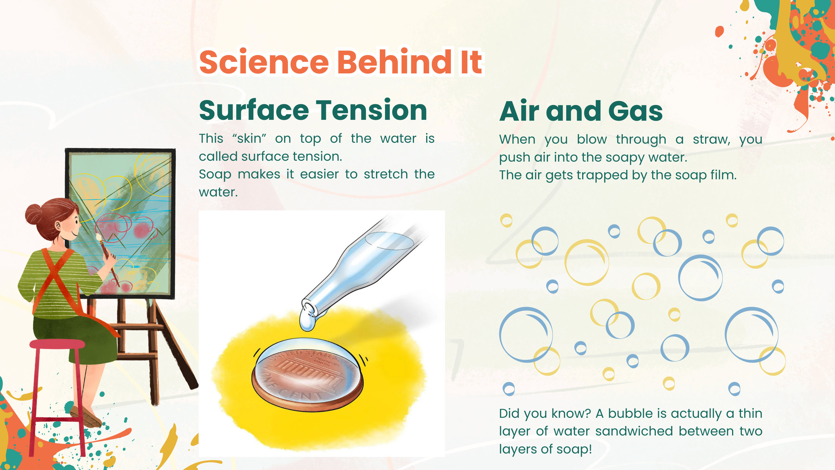
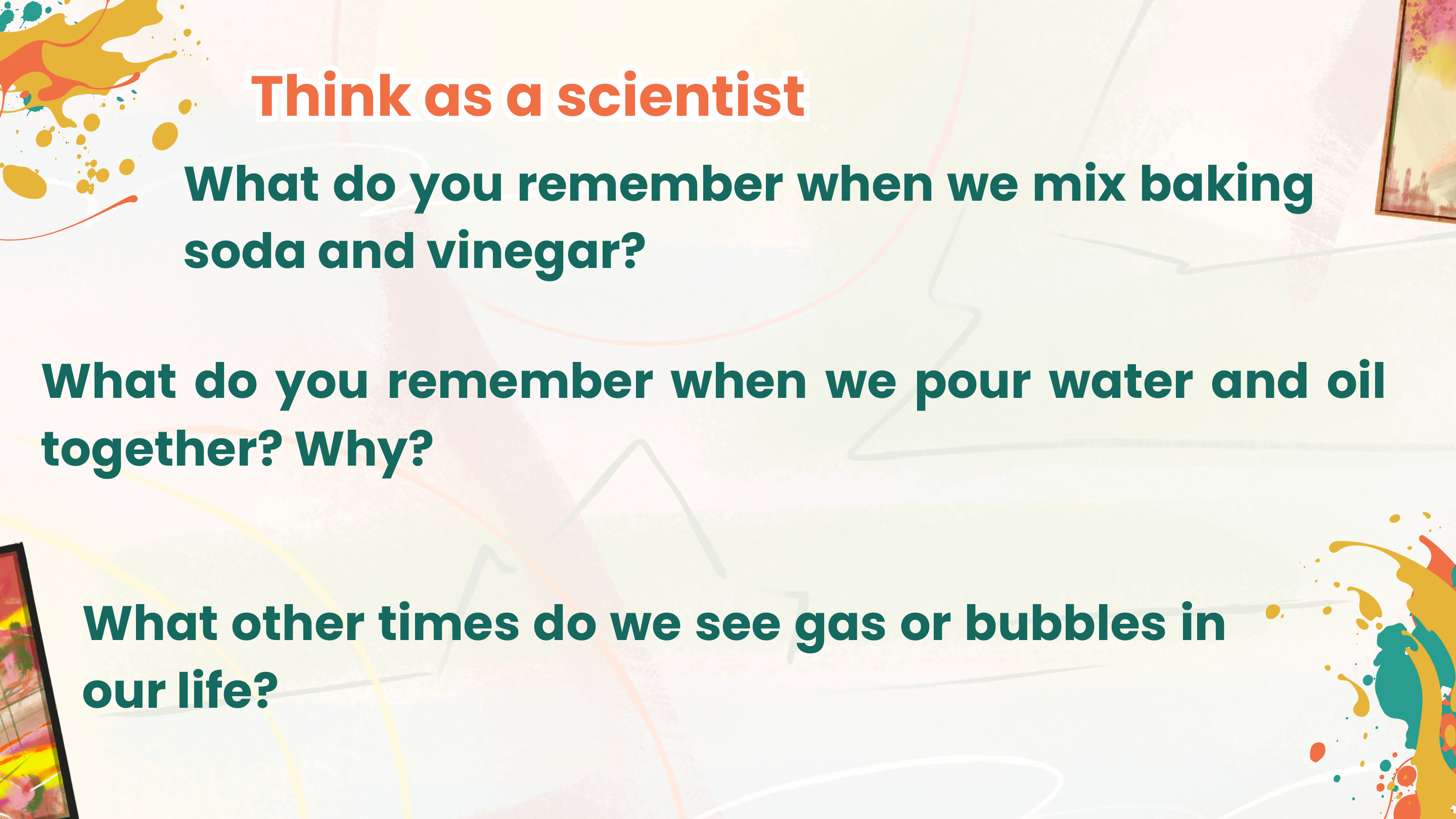
Discovering Science Through Art is a 9-week after-school STEAM curriculum designed for elementary school students through the Togetherhood platform, which connects enrichment providers with schools to deliver after-school programming. Each weekly session pairs a hands-on art project with a core science concept, turning material exploration into a way of understanding ideas like surface tension, density, magnetism, and chemical reactions.
Rather than teaching science and art as separate subjects, the curriculum uses art-making as the primary mode of scientific inquiry. Students learn by doing: mixing, pouring, pressing, and observing what happens, then reflecting on what they noticed and why.
The core design question was: how do you help elementary students grasp abstract science concepts like surface tension, density, and chemical reactions in a one-hour weekly session, without turning it into another lecture? The constraints were real: mixed grade levels, limited materials budget, and only 30 minutes of hands-on time per session.
The 9-week sequence is designed so that concepts build on each other. Early sessions introduce single ideas (absorption, magnetism), while later sessions layer multiple concepts together.
| Week | Project | Science Concept |
|---|---|---|
| 1–2 | Salt + Paint Path Painting | Absorption, Capillary Action |
| 3 | Painting with Magnets | Magnetic Force |
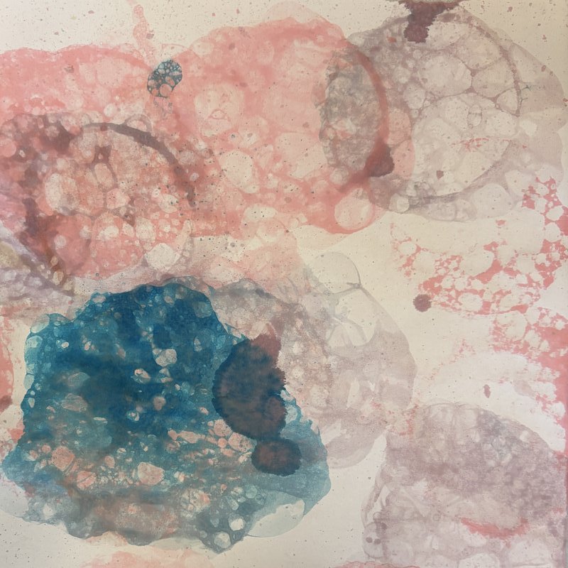
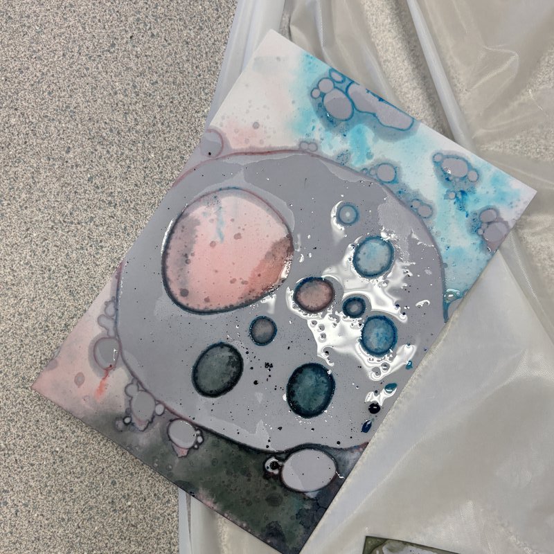
| 4 | Bubble Prints | Surface Tension, Air & Gas |
| 5 | Marble Prints | Density, Oil & Water |
| 6 | Pokémon Power Painting | Chemical Reaction, CO₂ |
| 7 | Lava Lamp | Density + Chemical Reaction (combined) |
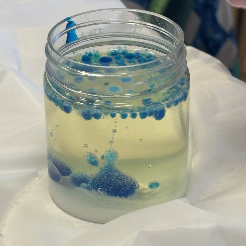
| 8 | Milk Firework | Surface Tension + Soap |
| 9 | pH Art | Acids, Bases, Anthocyanin |
Each session is supported by a slide deck that walks students through the science concept, step-by-step instructions, and reflection prompts. Below are three representative examples showing how the slides handle concept translation, curriculum sequencing, and reflective facilitation.
Week 4: Bubble Prints — Science concept explained in child-friendly language
A selection of student work from across the semester, showing the range of outcomes produced through the same activity structures.
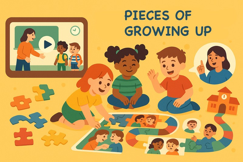
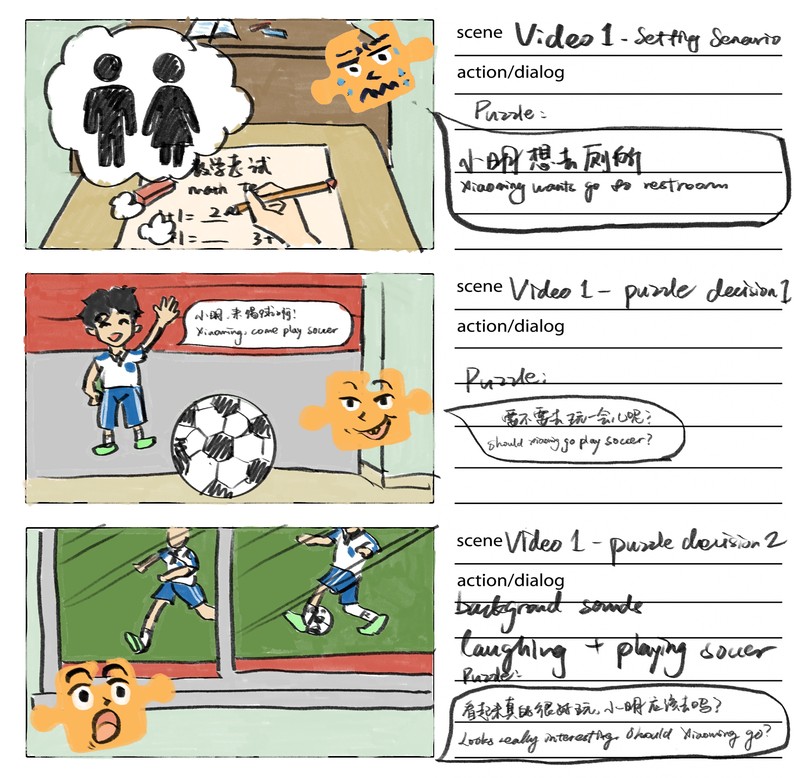
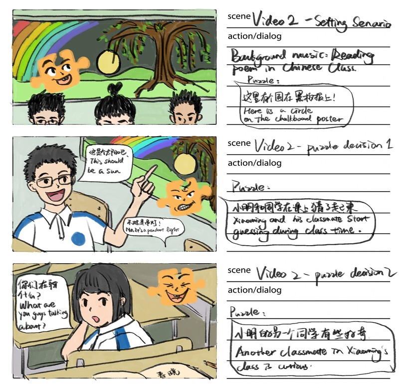
Pieces of Growing Up is a classroom-based social-emotional learning experience designed for first-grade students transitioning from kindergarten to elementary school in China. The project combines short narrative videos with a physical puzzle decision-making activity, where students guide the main character through everyday school scenarios by selecting puzzle pieces that reflect appropriate social-emotional responses.
Developed as a group project for Harvard EDU T566: Learning Design for All, the experience follows a Prep–Watch–Decision–Discuss cycle that gives students immediate, non-punitive feedback through color-coded puzzle pieces while teachers facilitate reflection and discussion.
In China, the transition from kindergarten to first grade focuses almost entirely on academic readiness, leaving social-emotional development largely unsupported. First graders suddenly move from play-based environments into structured classrooms where they are expected to follow rules, sustain attention, regulate emotions, and collaborate with peers. In Anhui Province, where class sizes are large and teacher training resources are limited, this gap is particularly visible. The project needed to deliver SEL support without adding preparation burden to already-stretched teachers, using only low-cost materials and existing classroom equipment.
The experience follows a four-stage learning cycle. Teachers set up materials and run a quick pre-assessment. Students then watch four short videos where the main character Xiaoming encounters familiar school-life scenarios. At each decision point, the video pauses and students choose from face-down puzzle pieces (gray side up), each marked with a simple cue—a letter, number, or icon—that corresponds to a possible response. After selecting a piece and placing it on the puzzle board, its color is revealed: yellow pieces represent more appropriate social choices and fit together into a bright, complete image, while blue pieces indicate less appropriate choices and create visible mismatches. After all scenarios, teachers lead a reflective discussion connecting the choices to emotions and social rules.
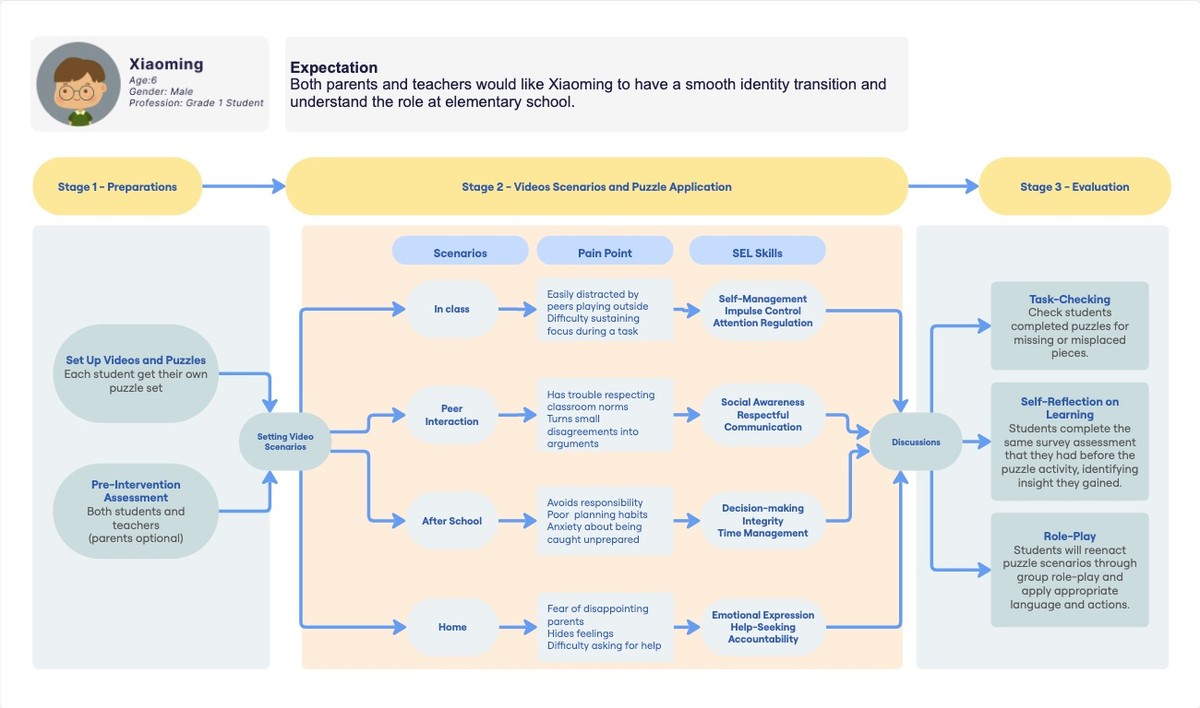
The storyboards translate each learning scenario into a visual sequence, from the initial situation through the decision point to the consequence. The final puzzle illustrations show the contrast between appropriate and less appropriate choices.
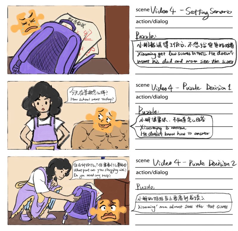

Storyboard: Video 1 — Classroom scenario with decision points
View full project presentation and learning experience walkthrough video →
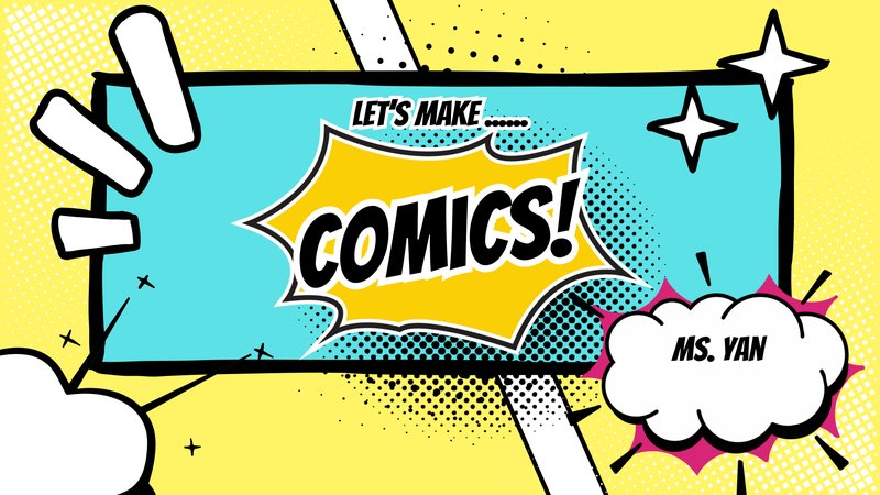
A 10-session after-school comic-making workshop for elementary students through the Togetherhood enrichment program. The curriculum progressively builds comic-making skills from basic panel layouts to a finished, coloured comic, covering character design, scripting, backgrounds, inking, zine-making, and collaborative comic jams.
Students came with widely varying drawing abilities and no prior experience with sequential art. The workshop needed to build comic-making skills progressively while keeping each session self-contained enough that students who missed a week could still participate. All instruction had to work within basic classroom supplies—pencils, markers, copy paper, and bristol paper—without access to digital tools.
| Week | Topic |
|---|---|
| 1 | Comic strip with panel layouts |
| 2 | Original character design |
| 3 | (Substitute session) |
| 4 | Creating a comic from a story prompt |
| 5 | Background & setting practice |
| 6 | Inking techniques |
| 7 | One-page zine |
| 8 | Comic Jam (collaborative) |
| 9 | Final comic — refined pencil sketch |
| 10 | Final comic — inking & colouring |
Each session opened with a short visual presentation introducing the week's concept through professional comic and manga examples, followed by step-by-step demonstrations and hands-on practice.
Week 1 — Comic strip with panel layouts
View full teaching slides on Canva: Week 1 · Week 2 · Week 4 · Week 7
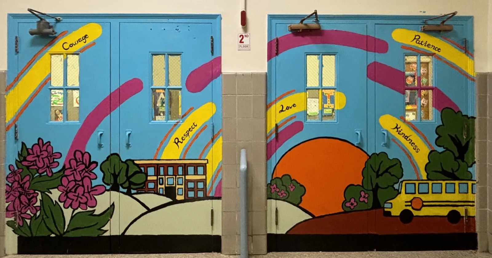
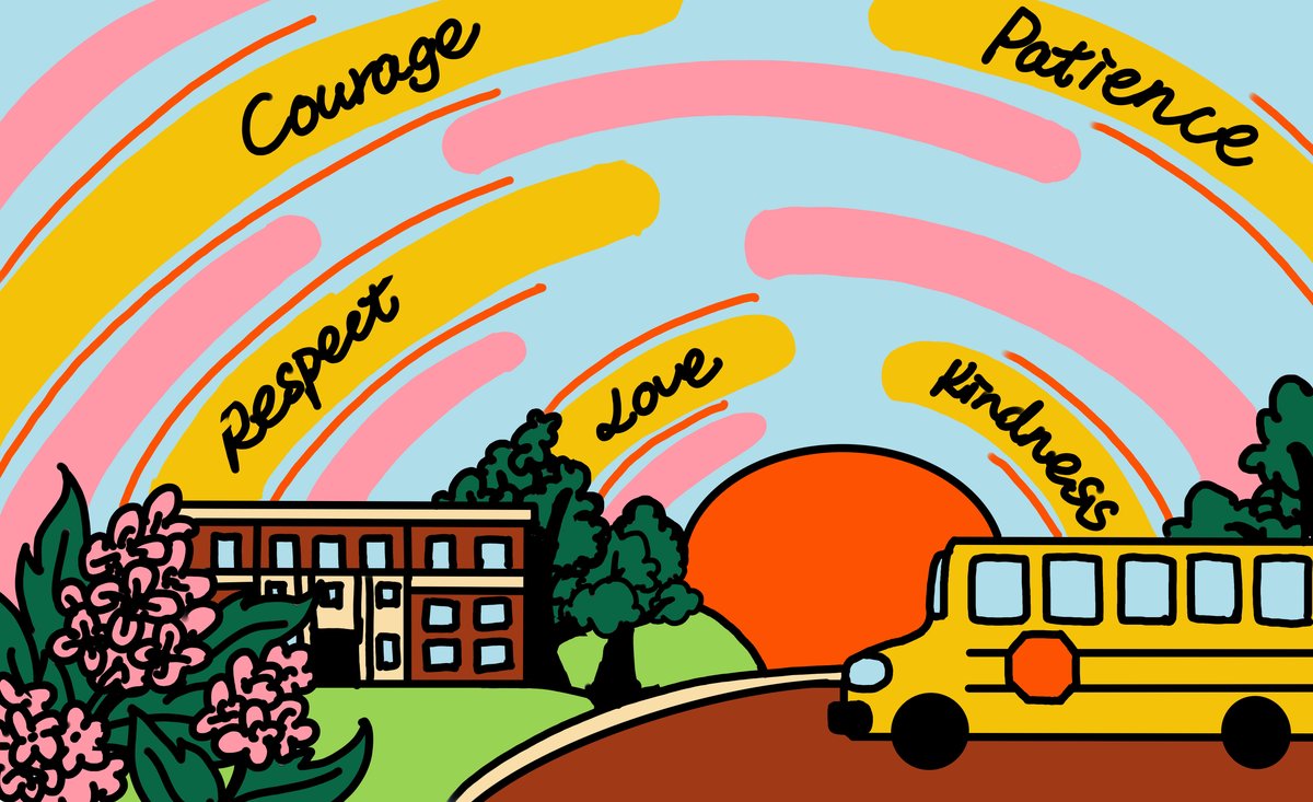
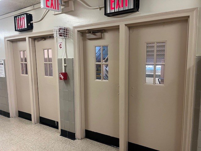
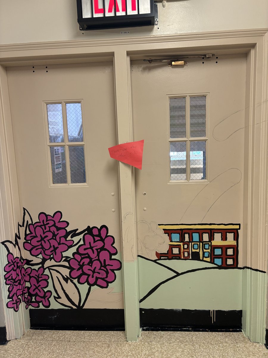
A collaborative mural project with 4th- and 5th-grade students through the Togetherhood after-school enrichment program. The project transformed four plain metal stairway doors into a continuous, full-colour mural celebrating school values—Courage, Respect, Love, Kindness, and Patience—through imagery grounded in the students' daily experience: their school building, cherry blossoms, a sunrise, and the school bus.
The school's second-floor stairwell had four plain metal doors (32″ × 80″ each) that felt institutional and disconnected from the vibrant community inside. The principal envisioned a sunrise with the school's five core values painted across the doors. The project needed to translate that vision into a cohesive design and execute it with two classes of students across eight 2-hour after-school sessions, with groups rotating in and out every 30 minutes. The design had to read as one continuous image across four separate doors and be durable enough for a high-traffic school environment—on metal surfaces that are especially prone to paint peeling.
The principal's brief called for a sunrise with the school's five core values across the doors. The final design reinterprets this as a single continuous scene spanning all four doors: the school building on the left, flowing colour bands carrying the value words across the centre, and a sunrise with school bus on the right. Cherry blossoms anchor the left edge, grounding the scene in the school's neighbourhood. The concept was developed through a hand-drawn sketch, refined into a digital composition, and then transferred onto the doors as a pencil outline before students began painting.
Digital sketch — final design mapped across four doors
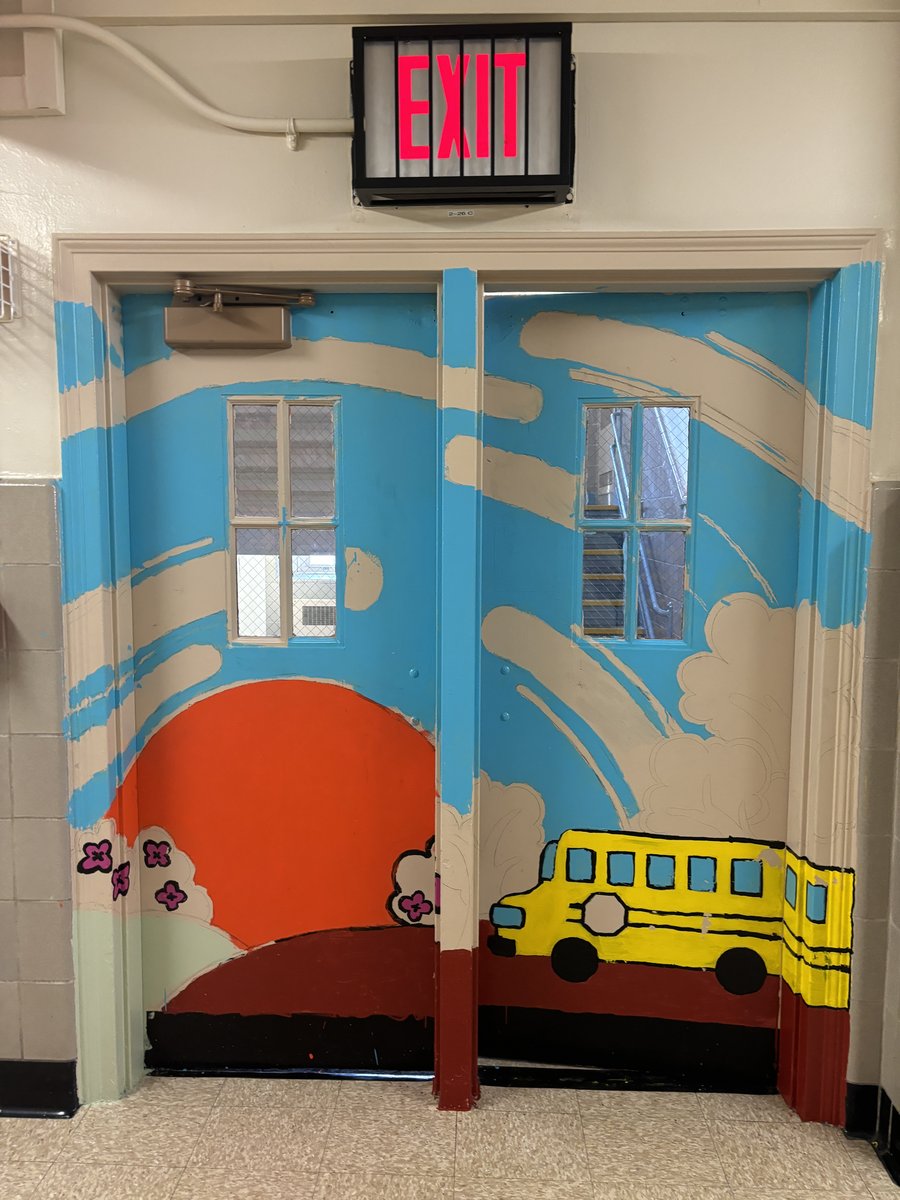

Completed mural — 5th grade side (staircase-facing)
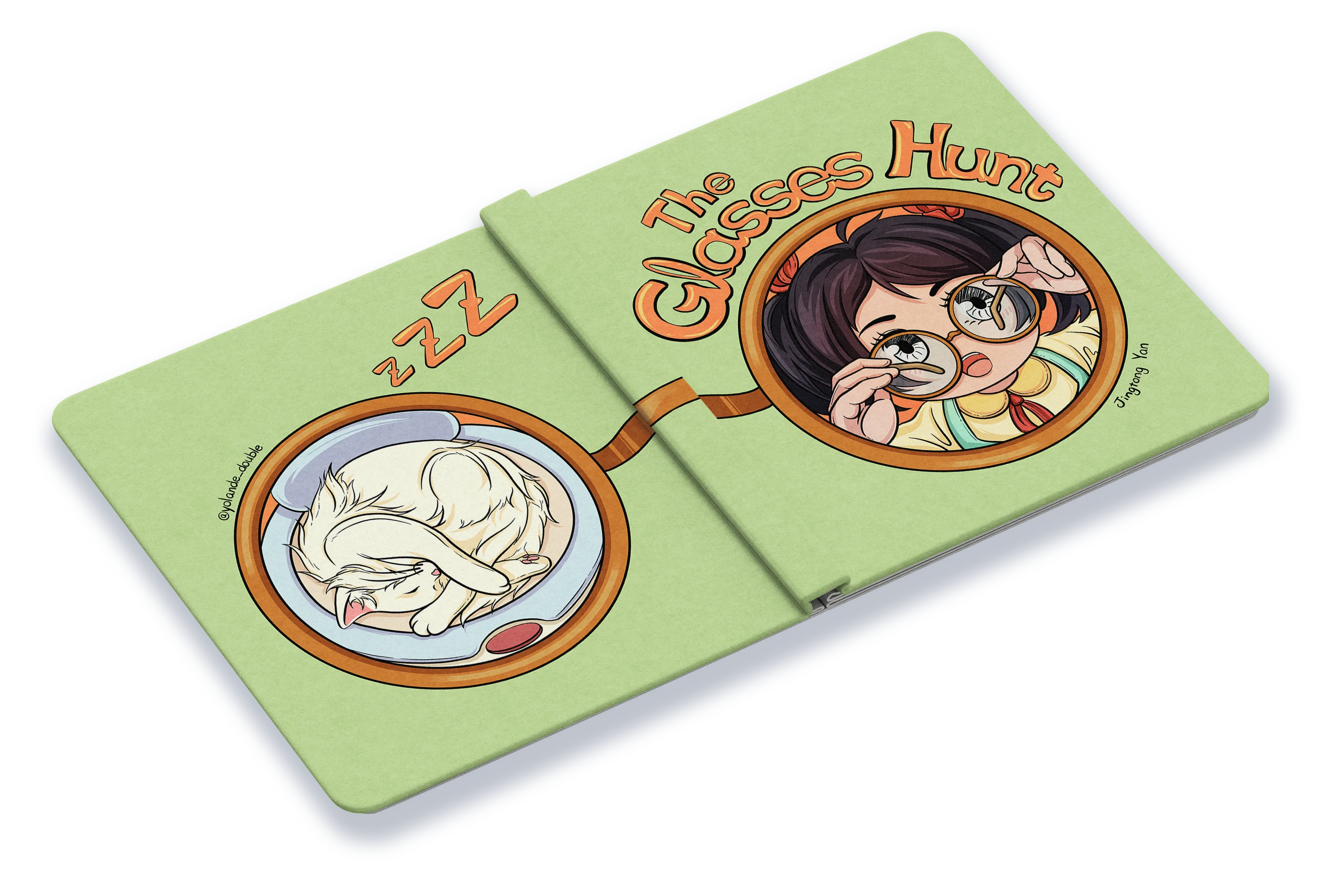
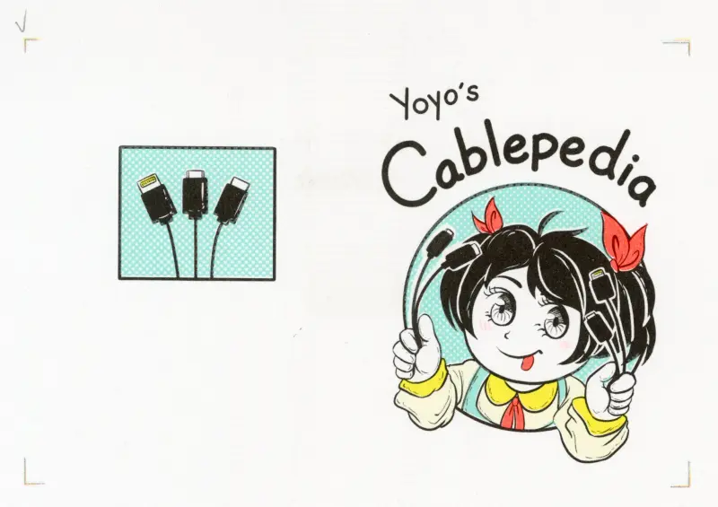
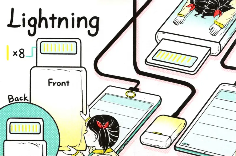
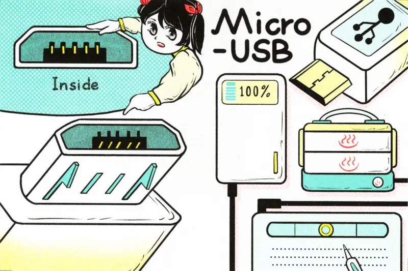
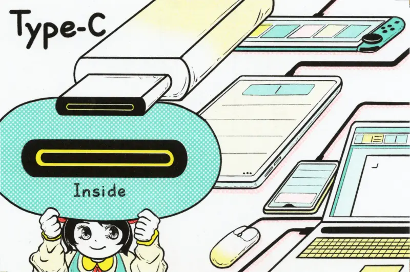
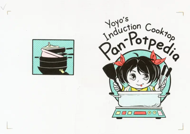
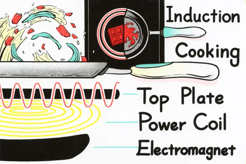
An interactive pop-up children’s book starring Yoyo and Grandma on a playful search for missing glasses. Through pop-up mechanisms, removable pieces, and hidden flaps, children explore each spread as a hands-on detective game. Two bonus Riso-printed zines—Cablepedia and Pan-Potpedia—tuck into the final spread, offering elderly readers clear visual guides to everyday technology. One book, two generations learning.
Most children’s pop-up books are designed for one audience: the child plays, the adult watches. The challenge here was to create a single book that gives both generations a meaningful learning experience. Children practise observation and problem-solving through interactive mechanisms, while grandparents gain practical knowledge through accompanying zines. The shared reading itself becomes a moment of intergenerational connection.
Every interactive element in the book serves the “find the glasses” story task—pop-ups, flaps, and removable pieces are learning mechanisms, not decoration. Children search, lift, pull, and discover, building observation and reasoning skills through play.
Two Riso-printed zines (4 × 6 inches each) tuck into the book’s final spread. They transform everyday confusion into clear, visual knowledge—designed so elderly readers can learn independently and share with others.
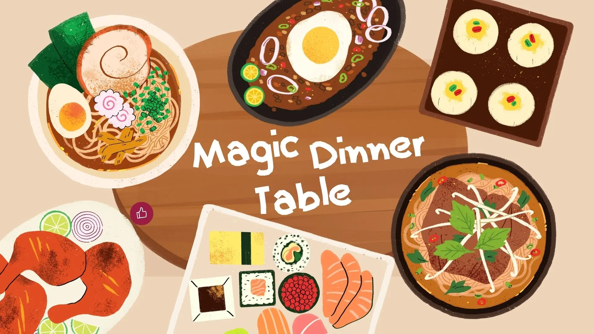
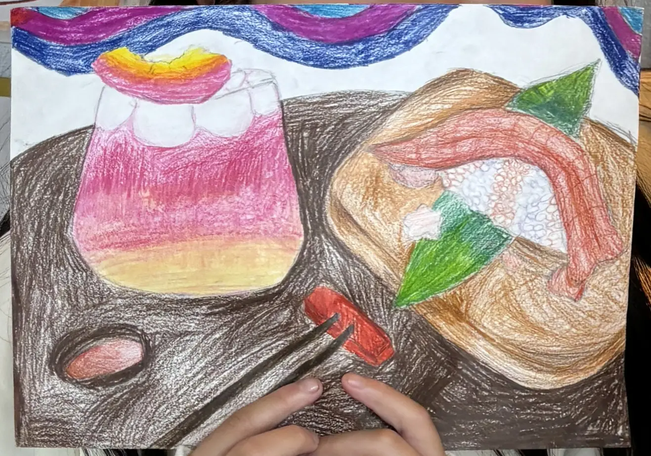
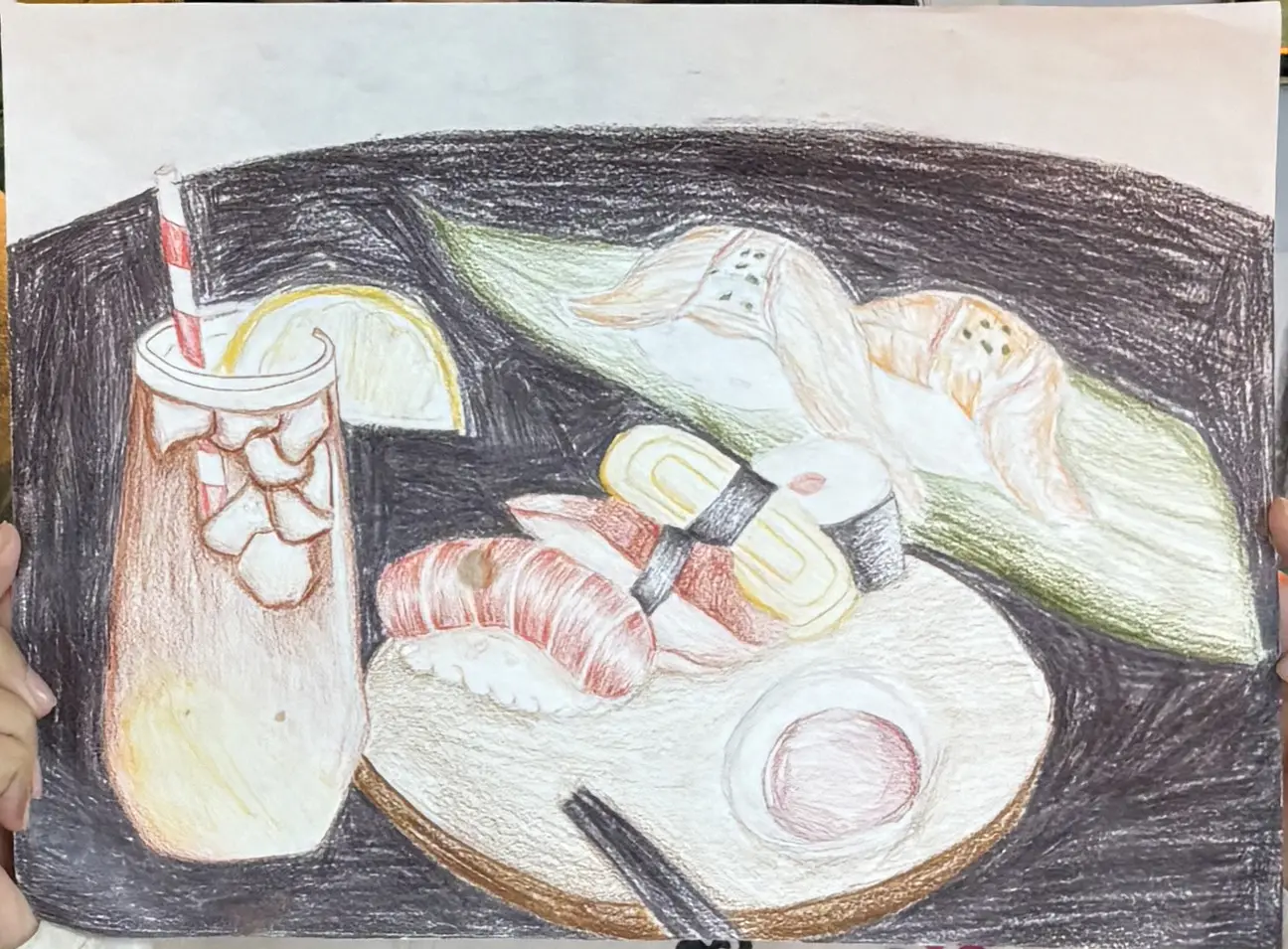
Magic Dinner Table was a 1.5-month competition-prep project for 12 students in grades 5 through 8 at a Chinese art studio in Queens, New York. The final works were created as drawing, painting, or mixed-media pieces on paper in response to a dinner-themed youth art competition.
What began as a technical drawing exercise gradually became a storytelling project. Instead of treating food only as still life, the learning experience invited students to connect dishes to family rituals, hometown traditions, and the emotional atmosphere of shared meals.
Students were already capable of making polished food drawings, but many of the early ideas felt disconnected from their own lives. The challenge was not simply to improve realism. It was to help students turn a competition prompt about dinner into artwork with personal meaning, while still meeting expectations for strong composition, appealing colour, and technical finish.
A selection of student pieces from Magic Dinner Table, showing how students translated the shared dinner theme into distinct visual stories shaped by memory, family rituals, and personal atmosphere.
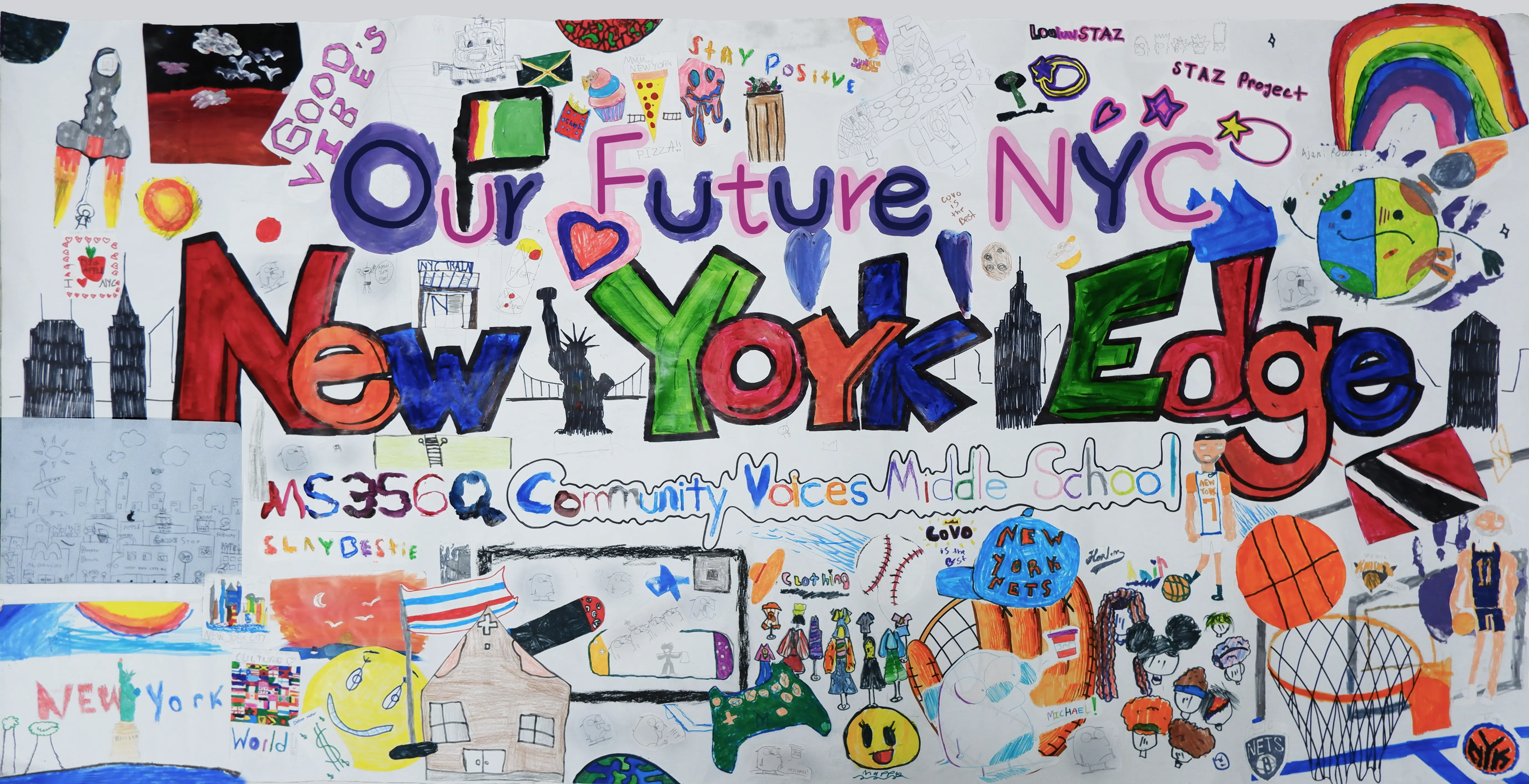
Our Future NYC was a collaborative banner project taught through a New York Edge-operated summer program at a public middle school in Jamaica, Queens. Rather than functioning as a one-off assignment, it was one part of a larger summer visual arts sequence, spanning multiple lessons focused on identity, monuments, neighborhoods, and New York iconography.
Within that broader curriculum, this banner unit asked students to imagine the future of New York City through culture, collaboration, and positive change. Many students initially saw art as disconnected from their interests, so I used culturally responsive brainstorming to connect the project to what already mattered to them: sports, local pride, family traditions, Caribbean identity, video games, and the visual energy of the city around them.
The project asked students to imagine a future New York City while meeting the real constraints of a contest banner: one shared message, one large collaborative composition, and clear inclusion of school information and New York Edge branding. The challenge was not just to generate ideas, but to help students in a Jamaica, Queens public-school summer program turn a broad civic theme into something personally meaningful, visually unified, and sustainable across several class sessions rather than a single workshop.
The banner unit sat inside a larger summer curriculum, so students encountered it as part of an ongoing New York-centered progression rather than as an isolated contest assignment.
| Week | Unit | Focus |
|---|---|---|
| July 10–14 | My Culture + Draw and Guess | Identity-building, participation, and group energy at the start of the summer |
| July 10–28 | Our Future NYC | Multi-session banner unit moving from brainstorming and draft-making into final banner production and wrap-up |
| July 24–28 | My NYC Monument | Sculptural thinking and civic imagination through monument design |
| July 31–August 4 | Our Renewable Global NY Neighborhood | Neighborhood-centered making and environmental thinking |
| August 7–18 | NY Icon Printmaking + Face-In-Hole Reflection | New York imagery, print processes, and reflective self-representation |
The final outcome brought together individual drawings, symbols, and cultural references into one shared banner. Rather than smoothing out differences, the composition preserved distinct student contributions while turning them into a collective collage-like statement about identity, community, and the future of New York City.
The key teaching material in this unit was a custom slide deck that created a shared structure for discussion before students began designing. Rather than functioning as a step-by-step script, the slides helped stage the movement from vocabulary, to reflection, to visual ideation, to collaborative drafting.
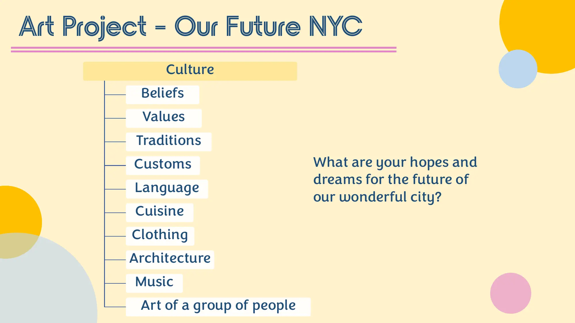
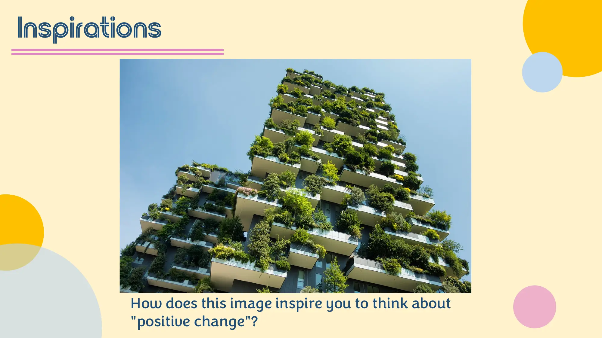
Big-picture prompt: inviting students to imagine hopes and dreams for the future of New York City
The slide sequence moved from broad visioning into more focused cultural reflection and then into collaborative planning. Instead of giving students a finished answer, the slides helped scaffold a progression: first imagining the future, then noticing examples of celebration and positive change, then connecting those ideas to their own lives, and finally translating them into a shared group draft.
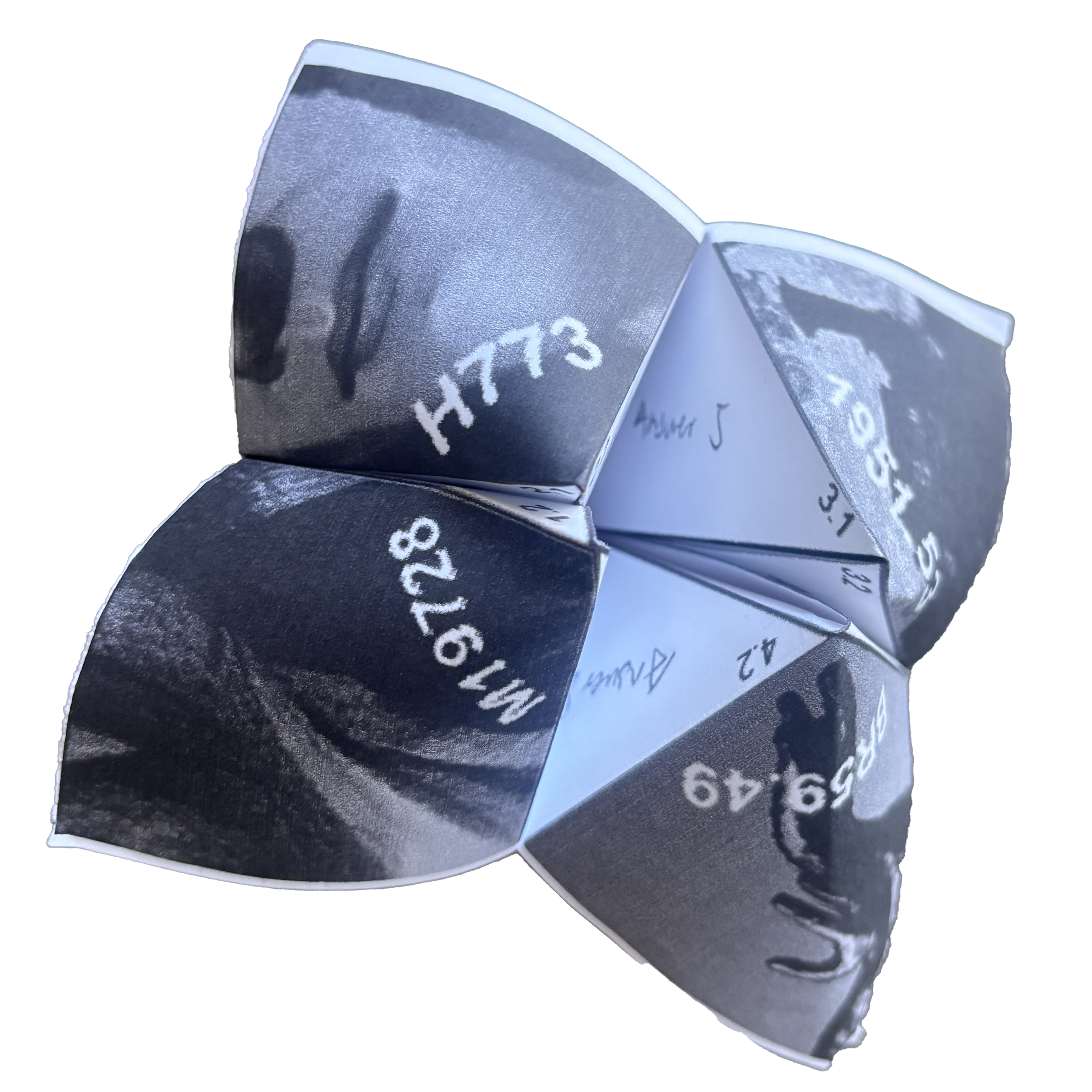
A gallery learning experience designed for the Harvard Art Museums, inviting Grade 11 and 12 students from international programs in Beijing public high schools to step away from the anxiety of college applications and build personal connections with artworks through self-reflection and relaxation.
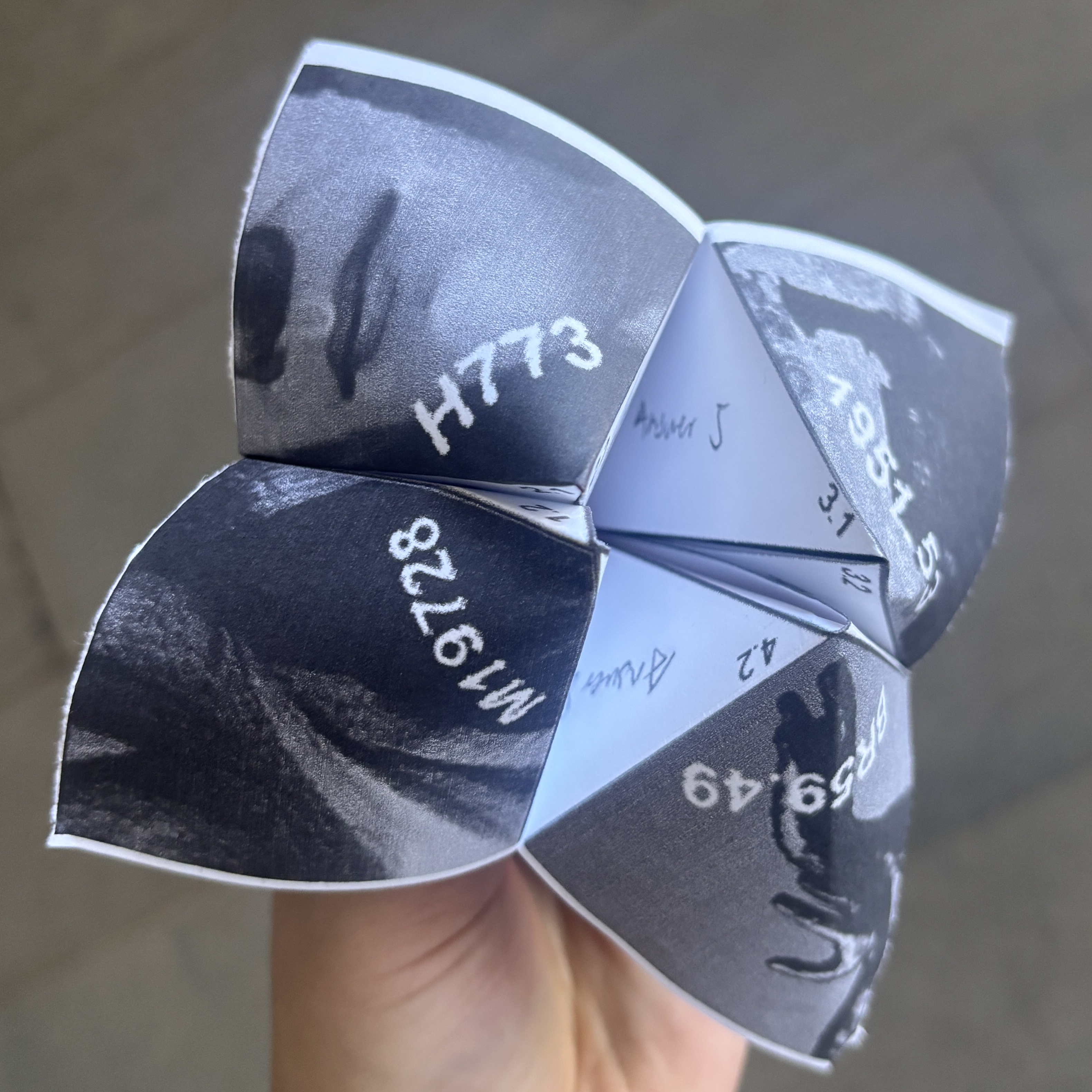
Participants visit four artworks that trace a journey through past, present, and future, responding to open-ended prompts on a foldable worksheet that becomes a Cootie Catcher (东南西北), a playable fortune teller familiar to both American and Chinese childhoods. They carry it with them as a symbol of confidence toward uncertainty.
Chinese high school students visiting U.S. universities during winter or summer breaks are typically in the middle of intense college application preparation. Their trips are academically driven, and museum visits, if included, tend to follow lecture-based formats focused on art historical information. The challenge was to design a museum experience that serves a different need: giving students a low-pressure space to reflect on their own lives, using artworks as starting points for personal meaning-making rather than academic performance.
Four works from the Harvard Art Museums were chosen to trace a journey from past through present to future. The program follows a physical path from the third floor down to the first floor.
Each stop follows a similar rhythm: silent looking, turn-and-talk, individual writing on the worksheet, and optional group sharing. The structure gradually builds comfort so participants feel safe sharing by the final stop.
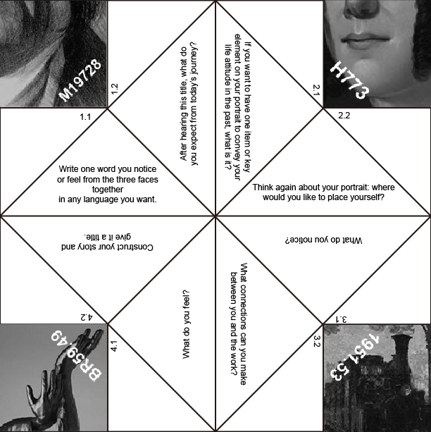
Click a section to explore each stop’s prompts
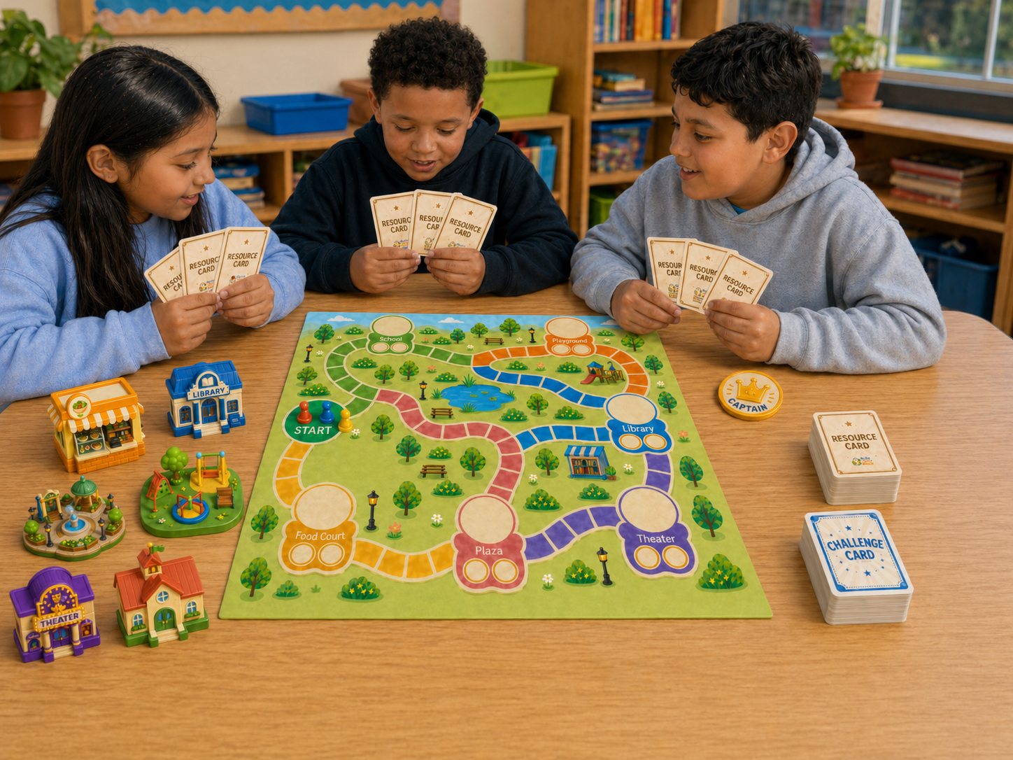
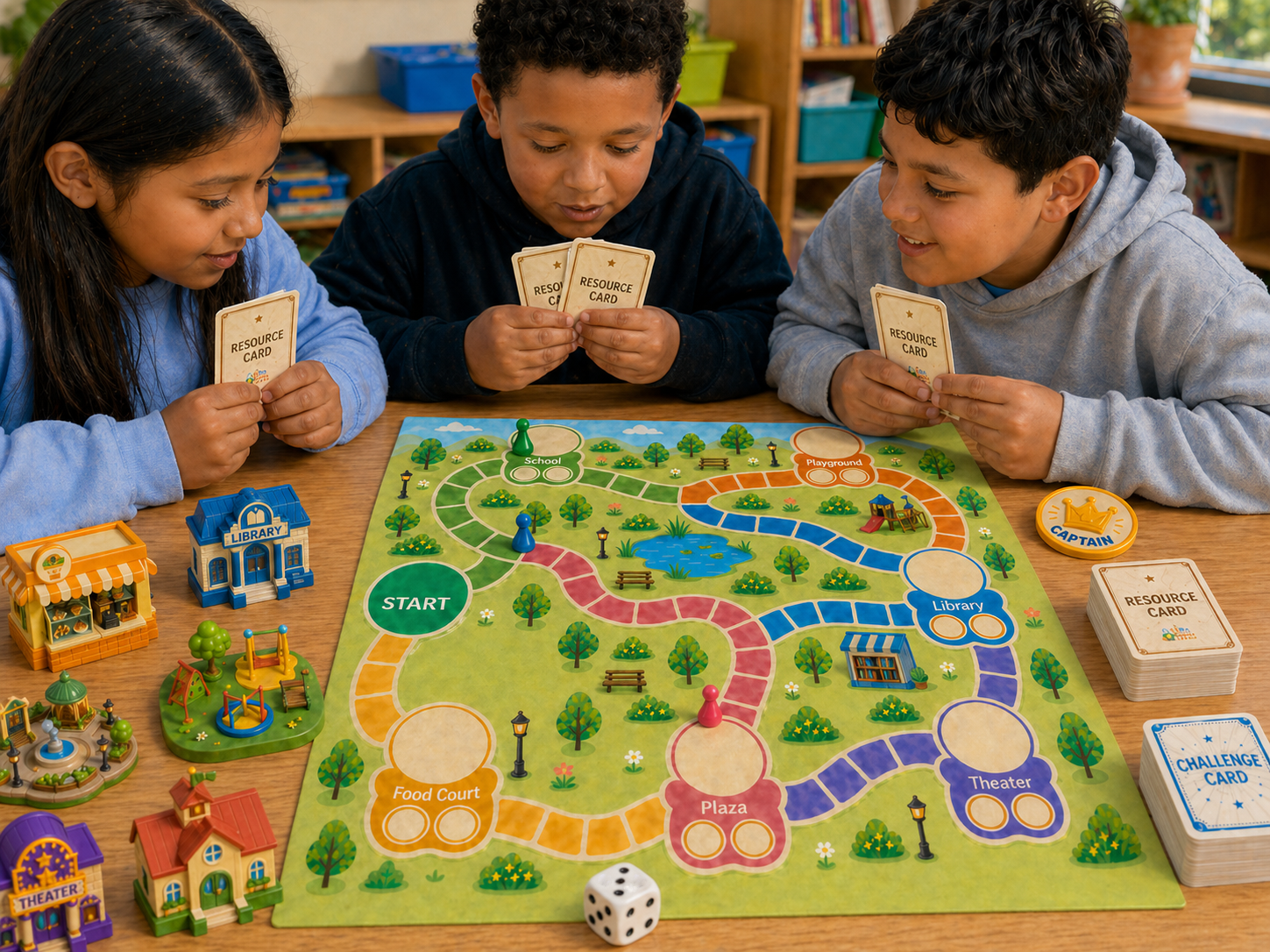
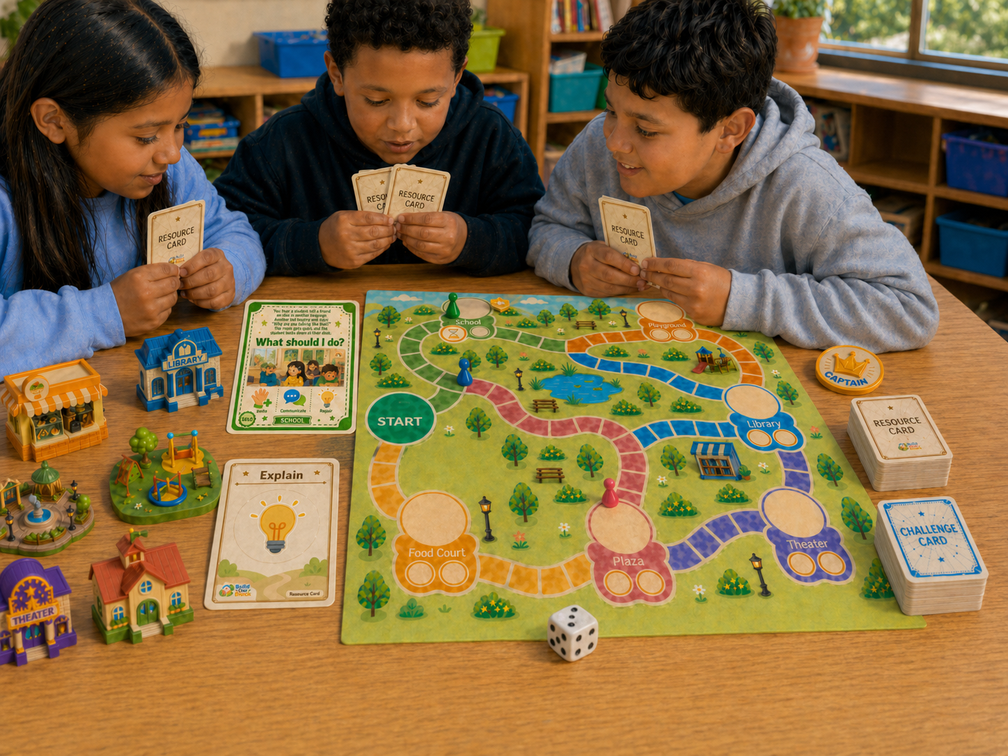
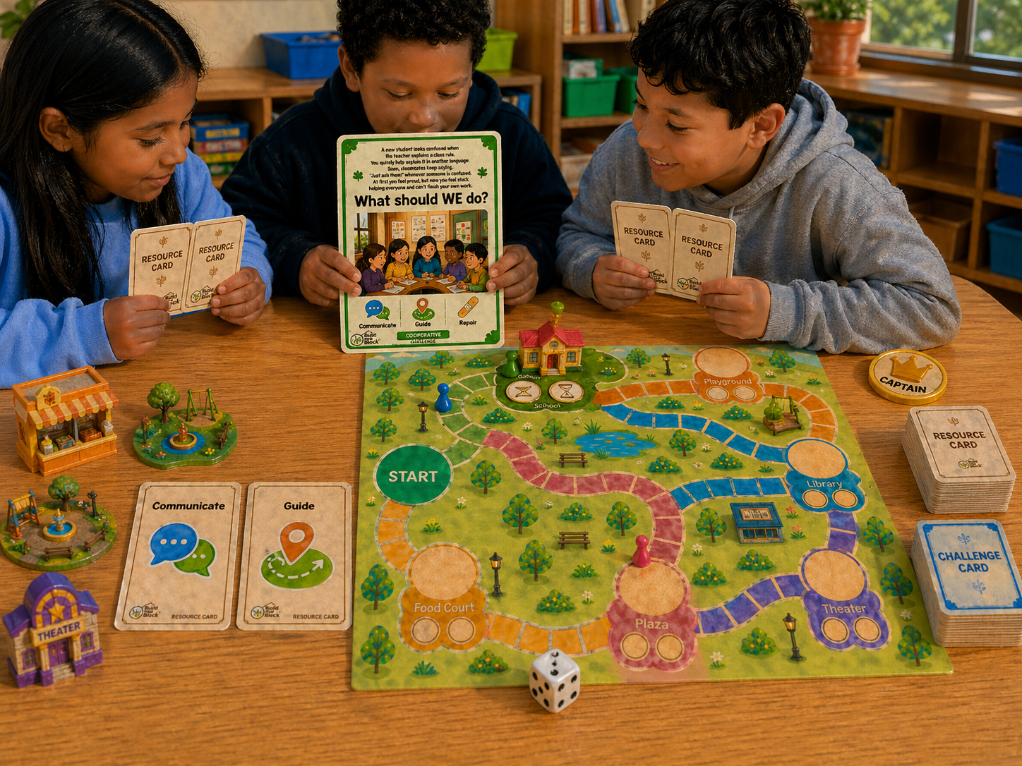
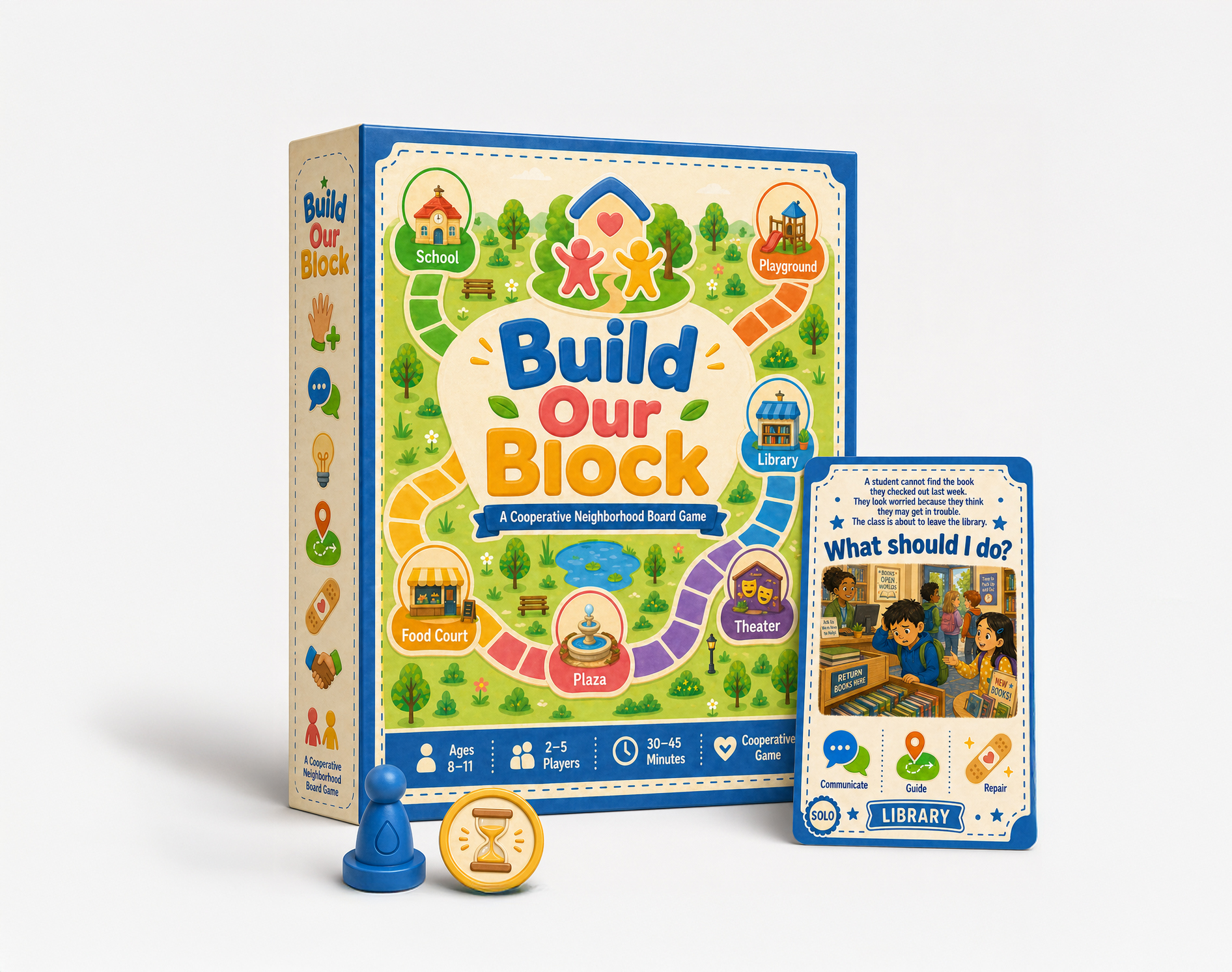
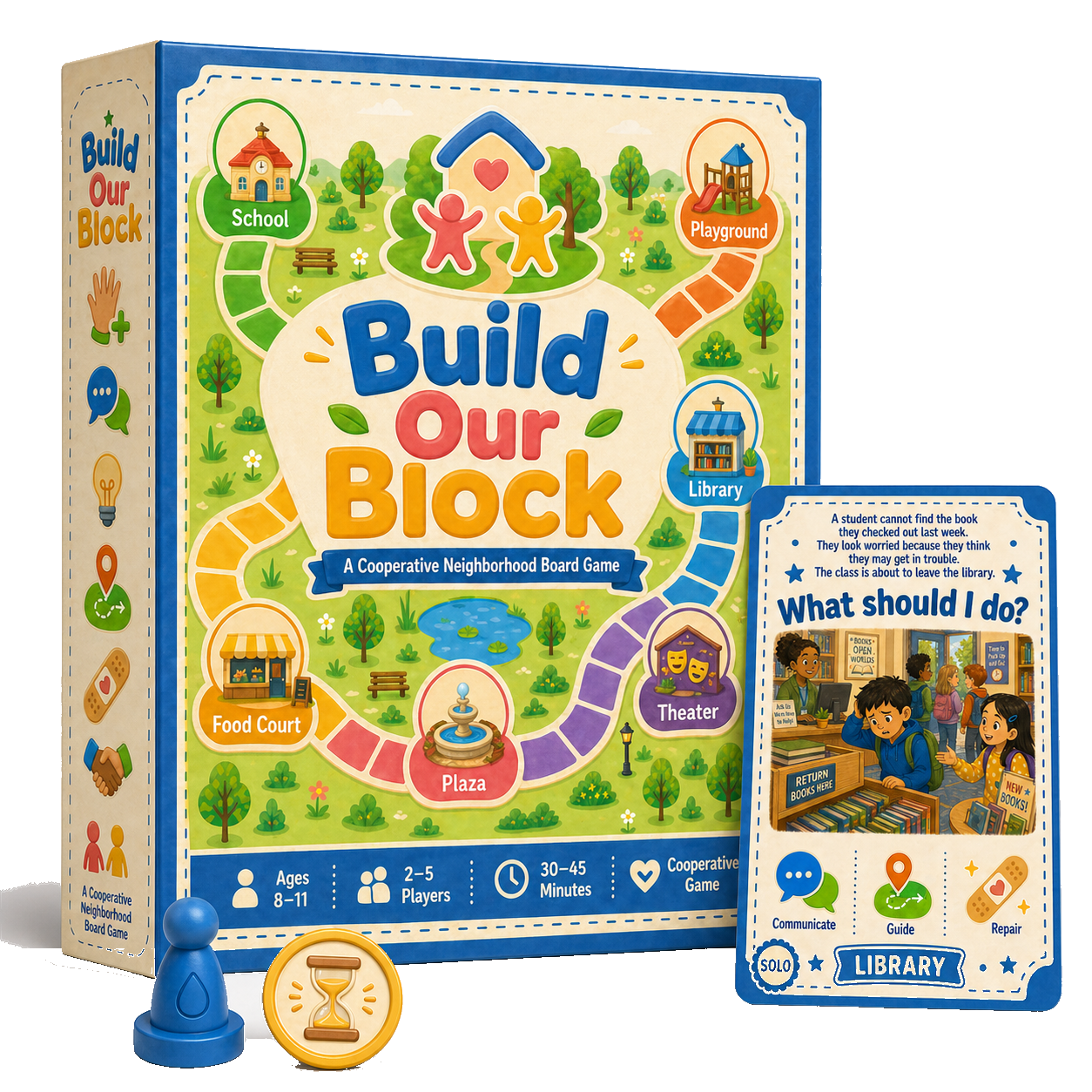
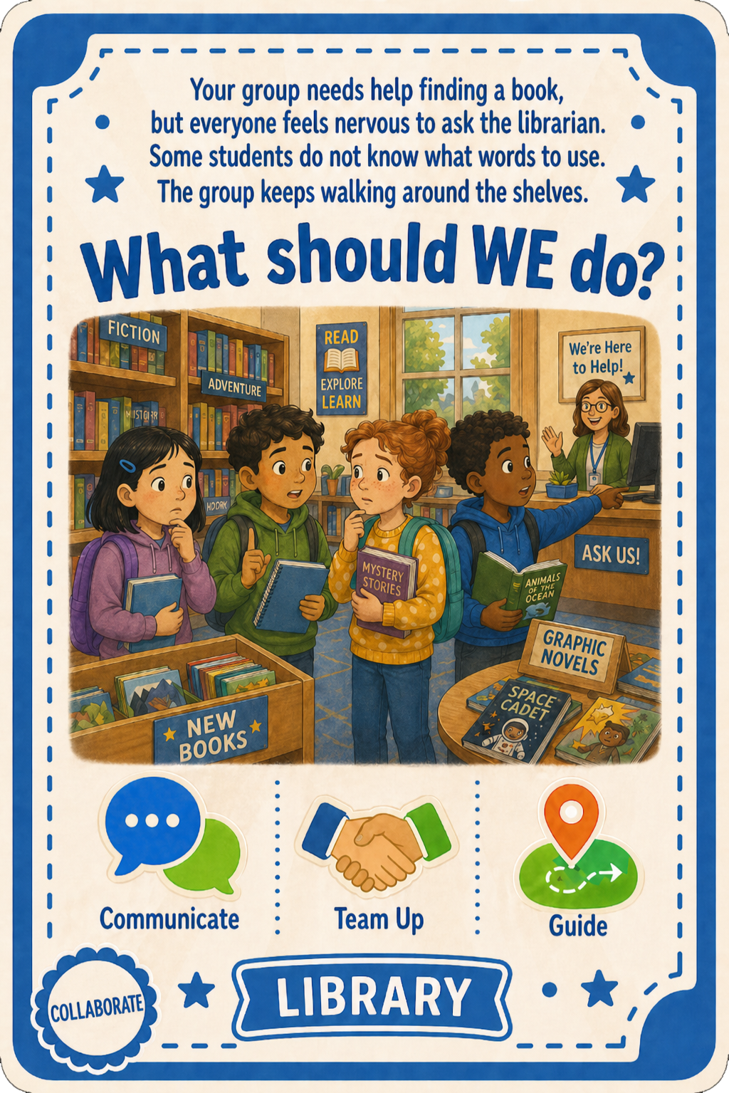
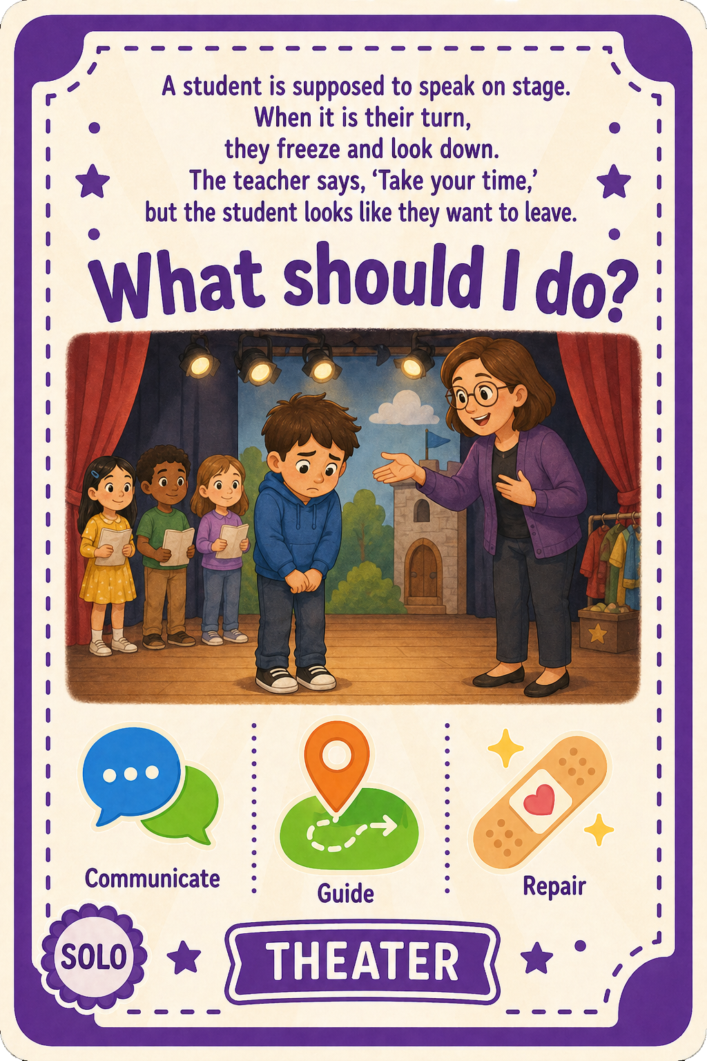
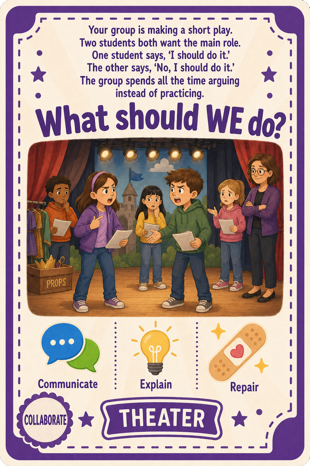
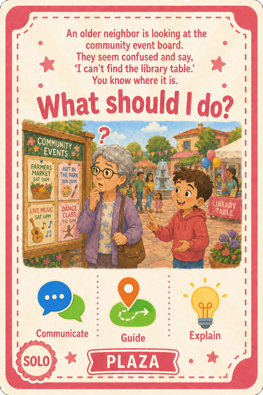
Build Our Block is a cooperative neighborhood board game for 2–5 players (grades 3–5, ages 8–11). Players work together to build community facilities by solving social scenarios drawn from real school life — navigating moments of exclusion, miscommunication, and cultural misunderstanding that immigrant-origin children encounter in peer spaces like recess, group work, and shared activities.
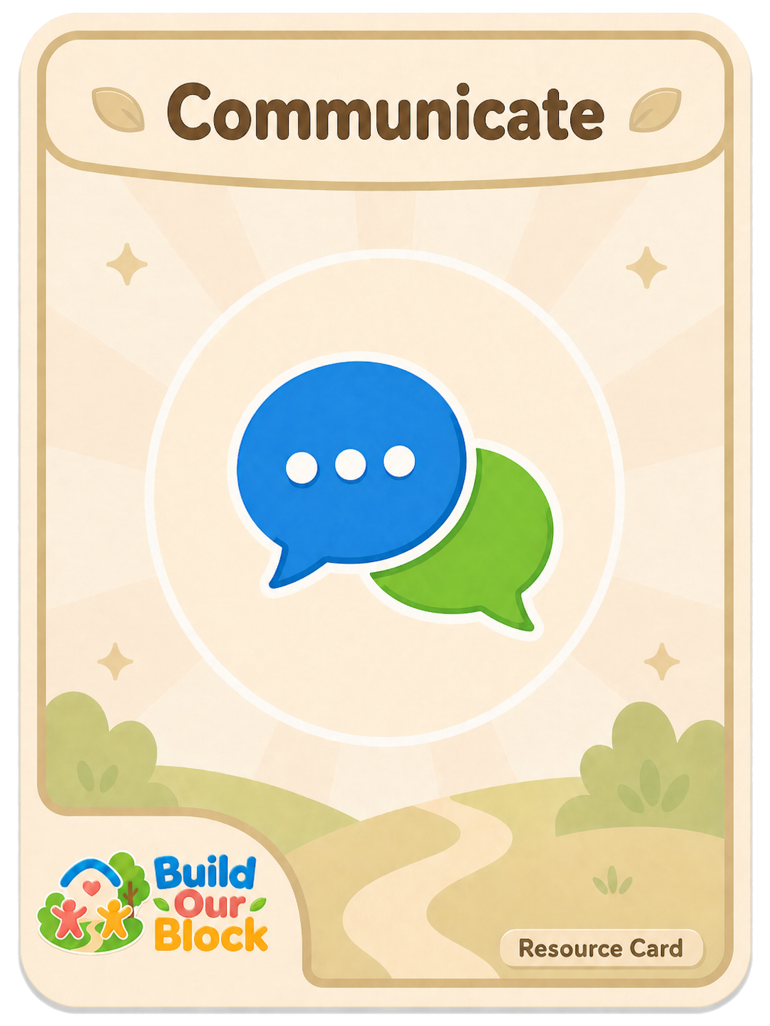
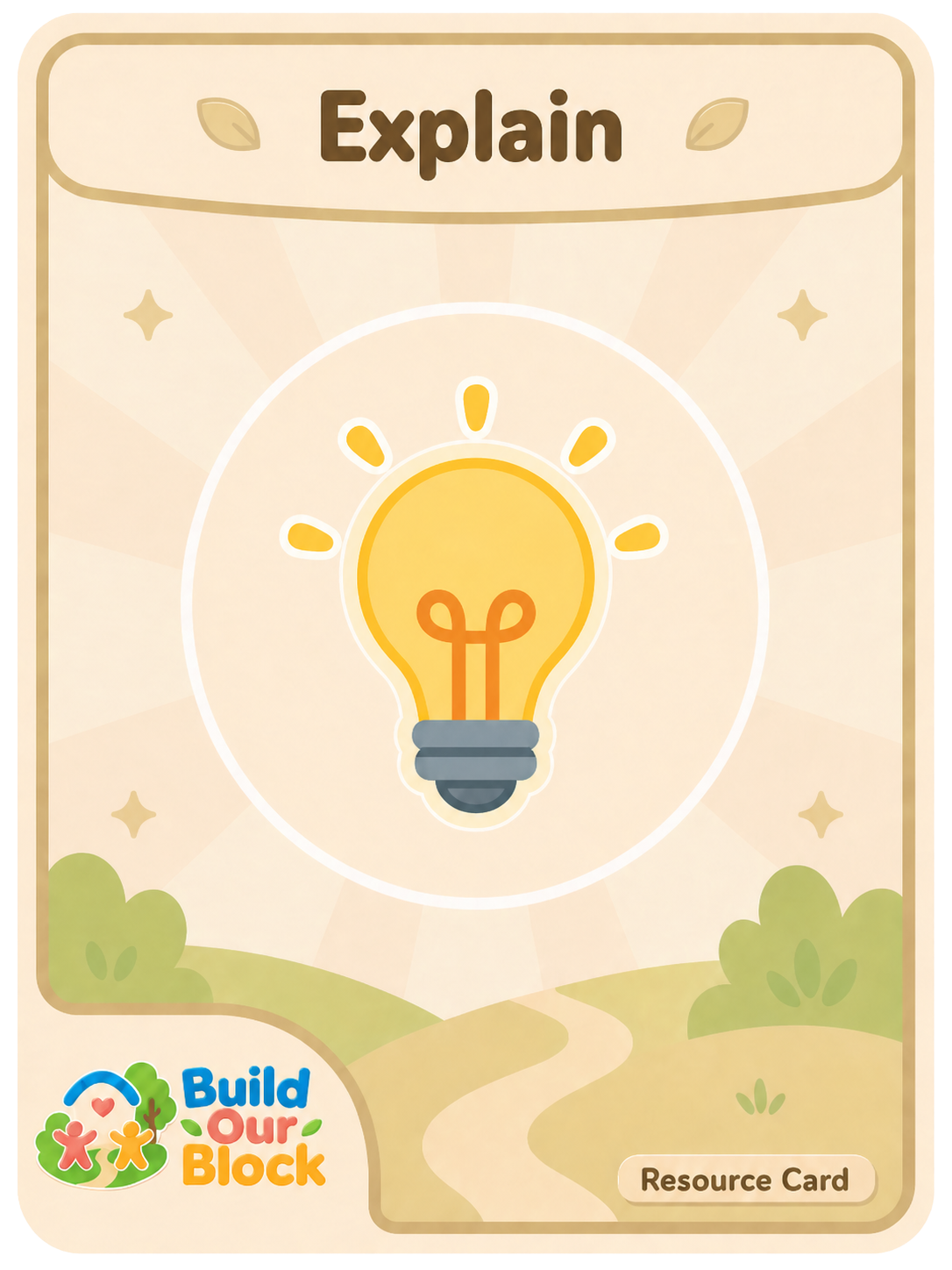
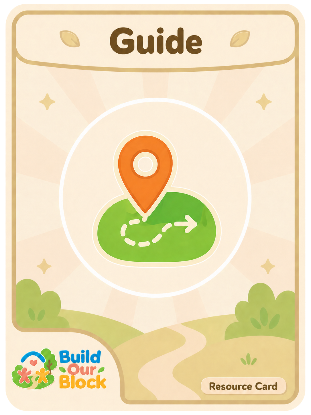
Rather than teaching children to “be welcoming,” the game gives them concrete, repeatable actions — invite, communicate, guide, explain, repair, team up — to practice inclusion as a collective skill. The design centers peer-to-peer agency: belonging is something children build together, not something adults assign.
How can newcomer children practice belonging in the everyday spaces where peer culture is actually formed — recess, group projects, shared play — rather than relying on adult-mediated interventions?
Recess and informal social time are daily “stress points” for newcomers, where exclusion is subtle but repeated and language barriers can escalate small misunderstandings. Most existing school supports are adult-oriented. This project asks what it looks like when children themselves practice inclusion — from the students, by the students, in the exact setting where peer culture is made.
Players work together to build community spaces before time runs out. The team must build at least 5 of 6 facilities before all 12 Build Tokens are used.
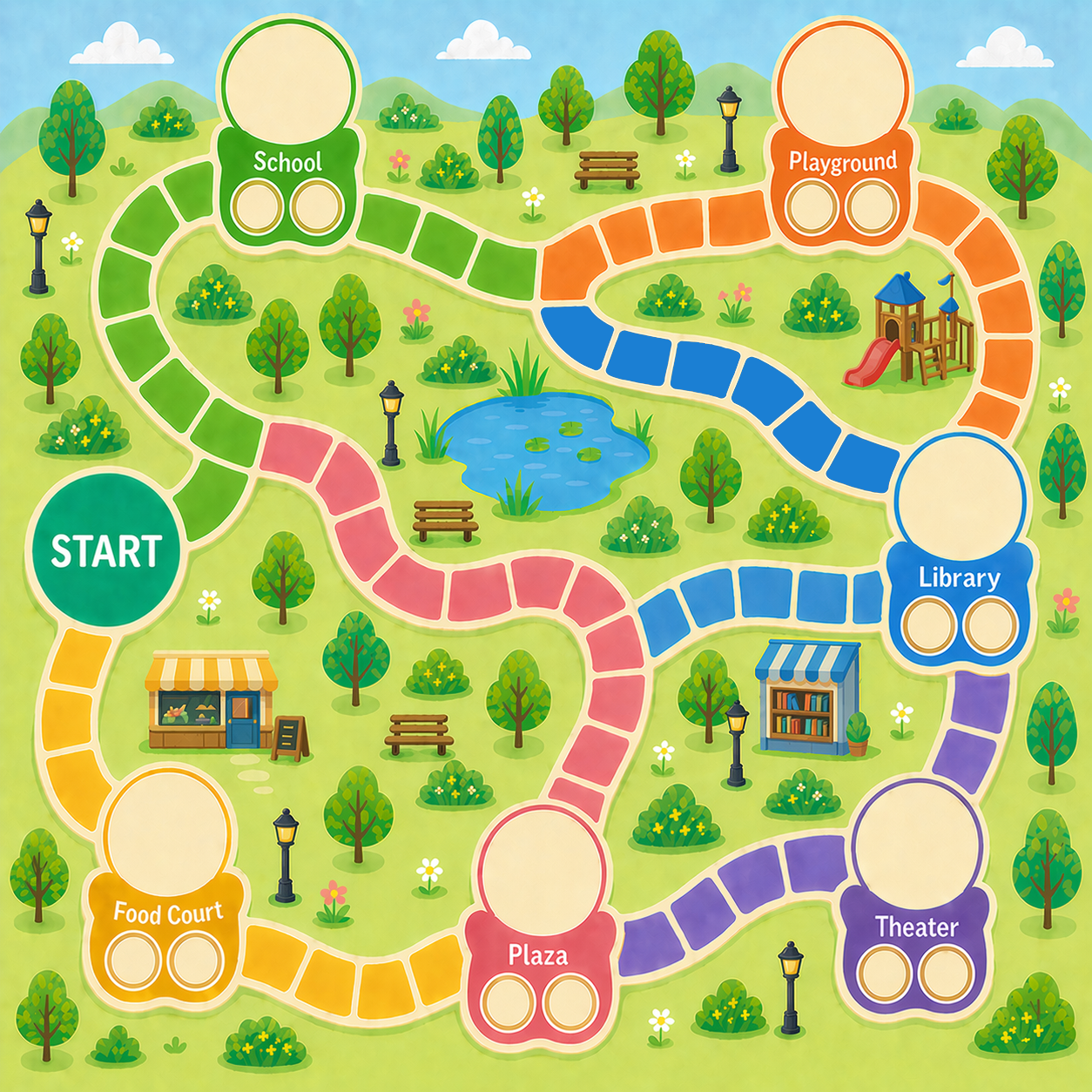
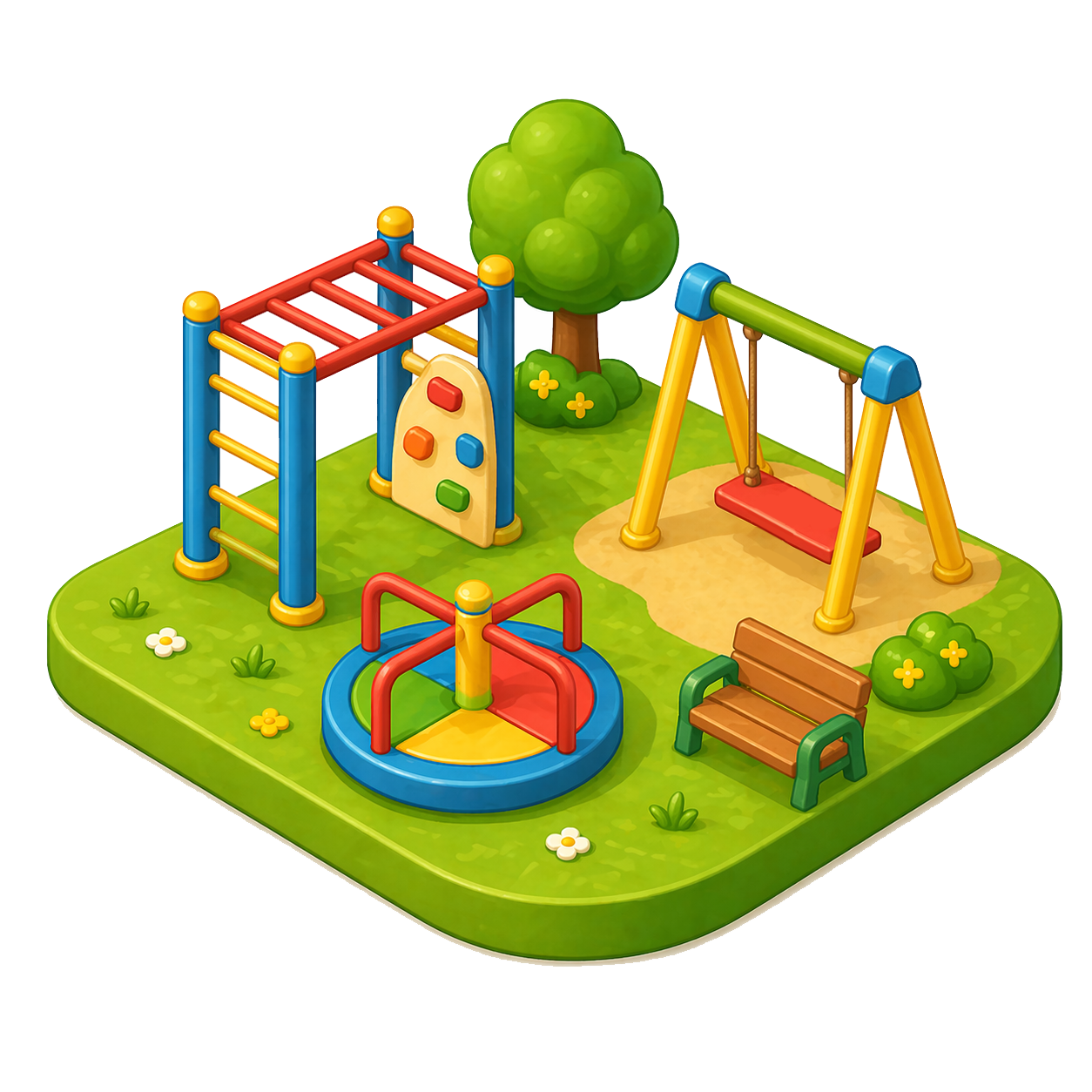
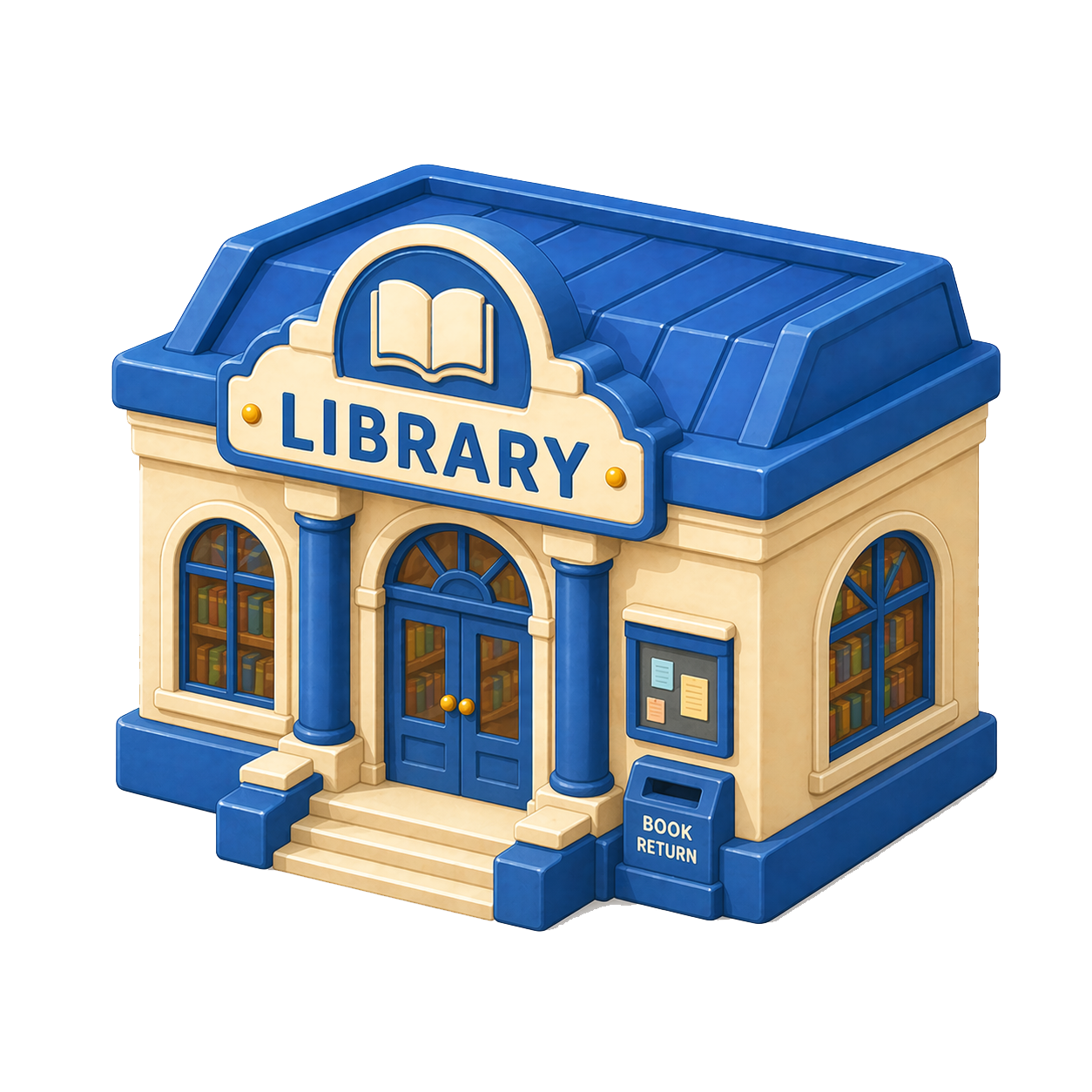
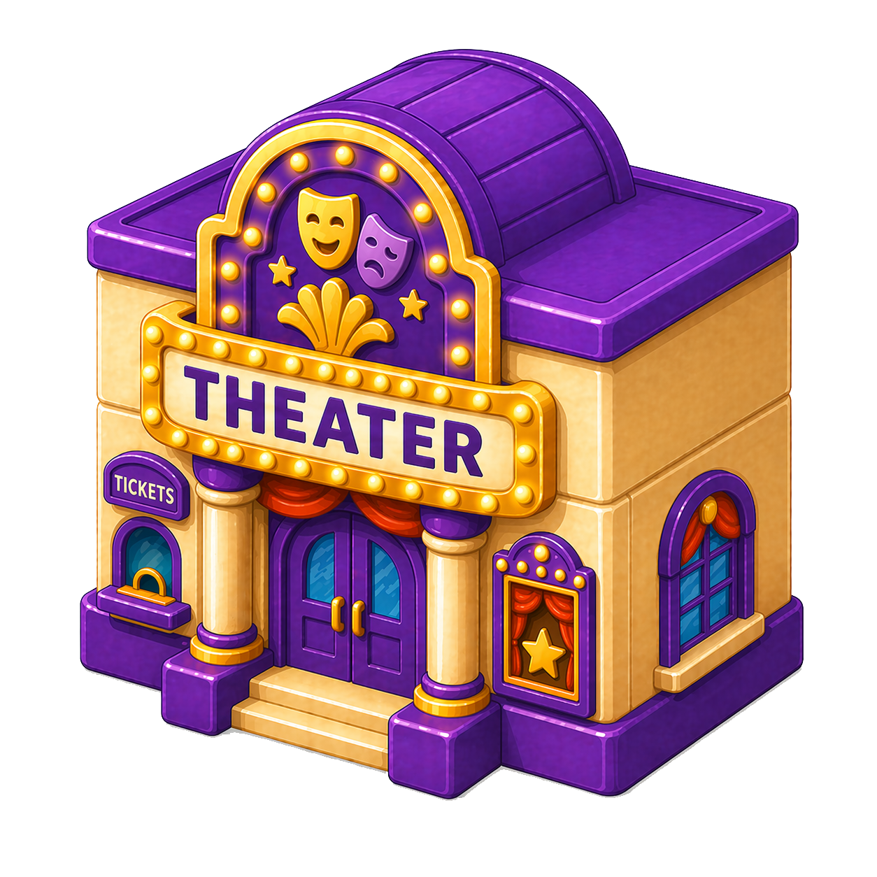
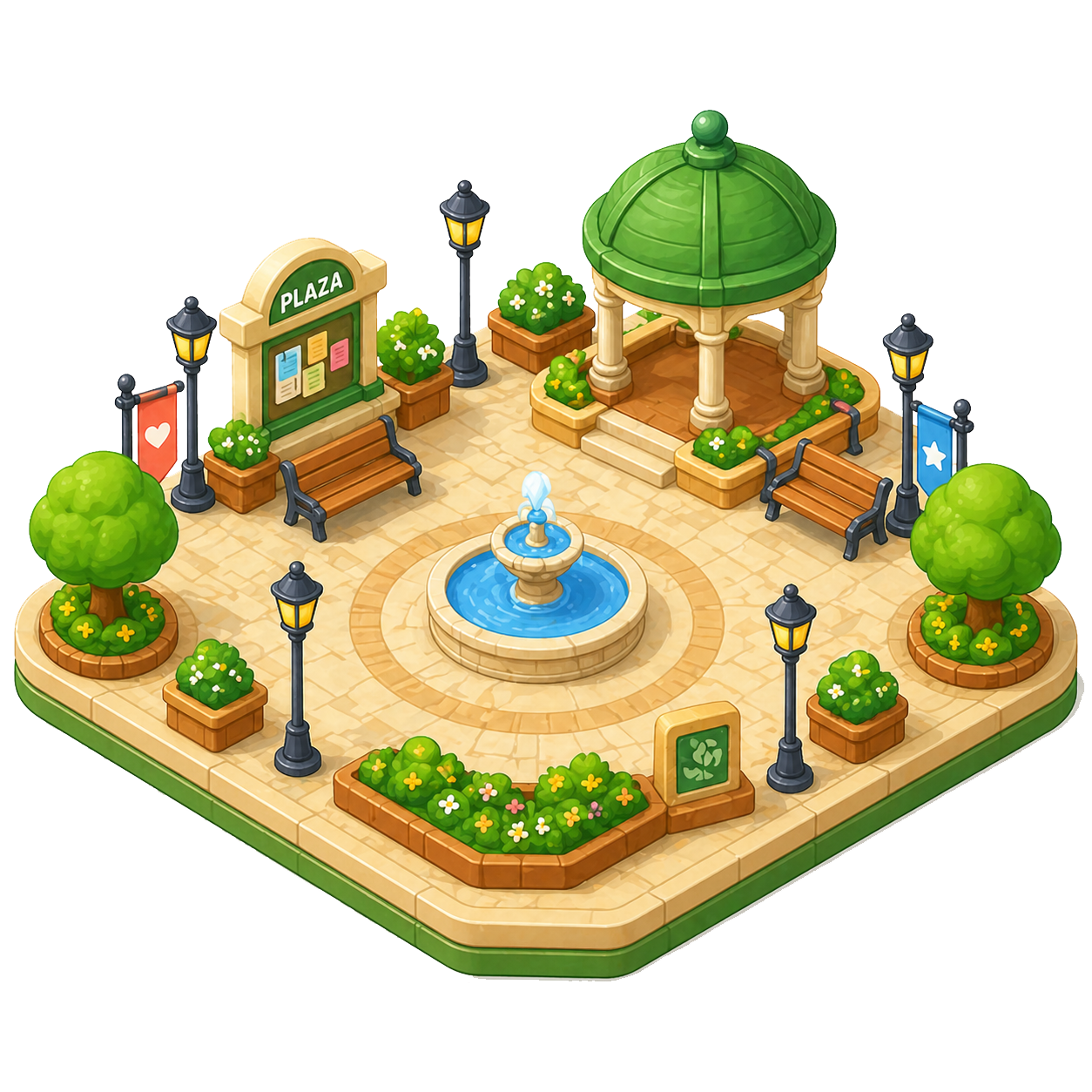
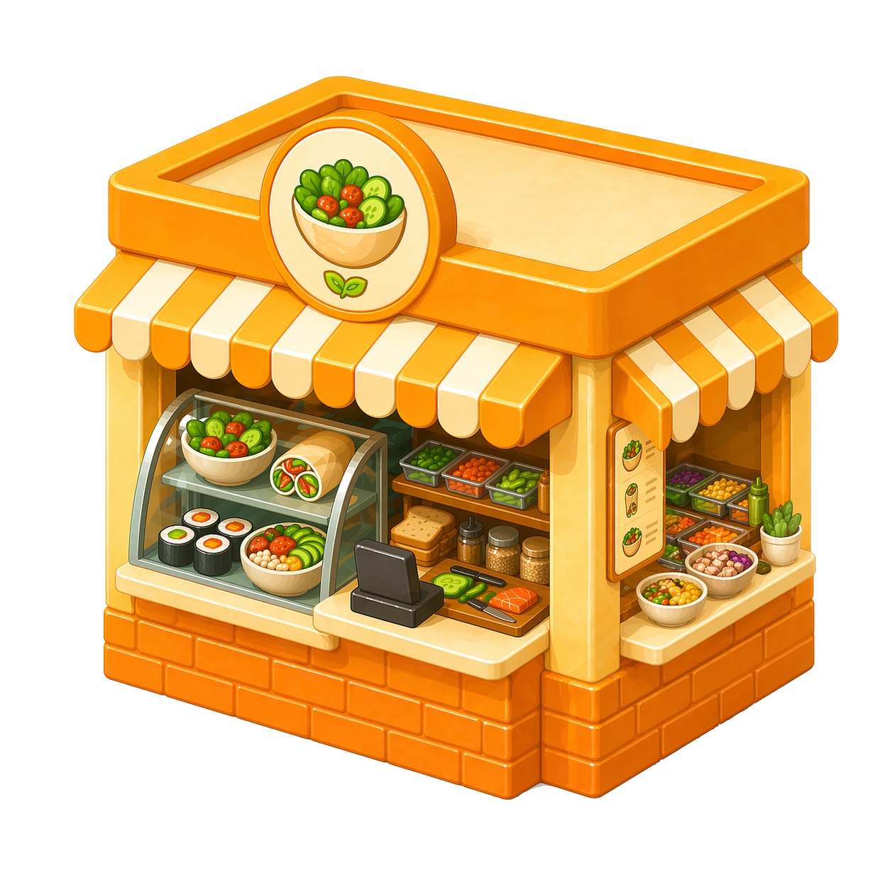
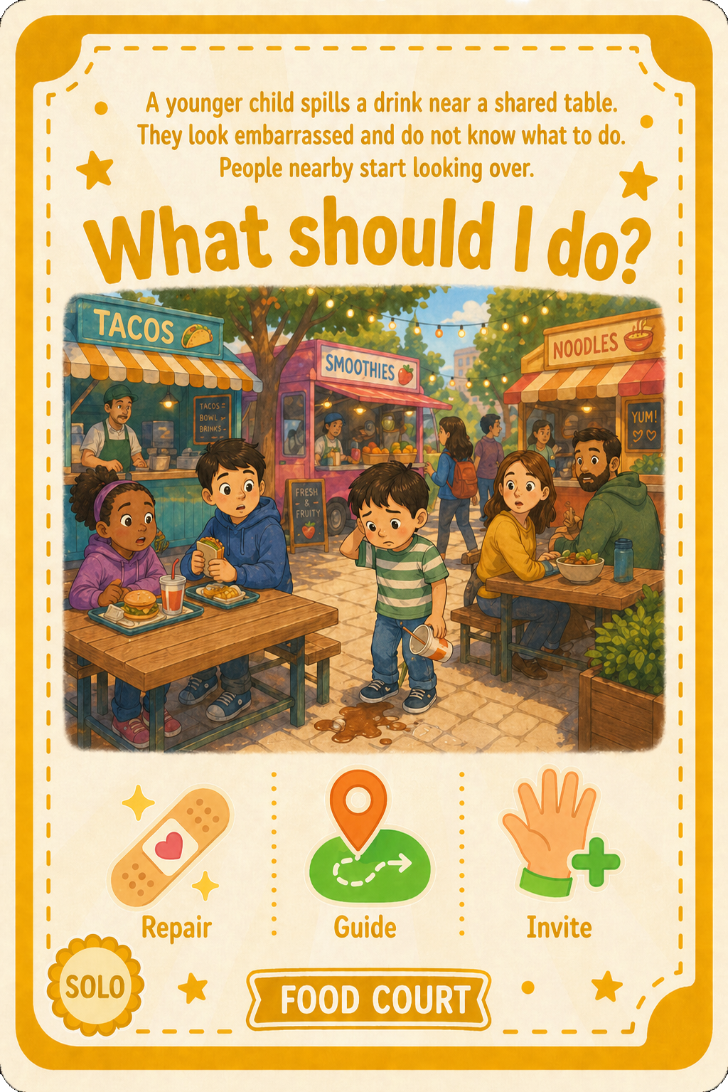
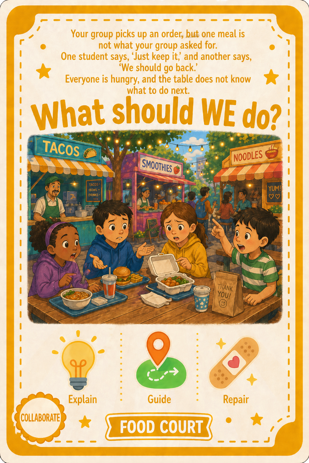
The board features a neighborhood map with 6 color-coded facility areas: School, Playground, Library, Theater, Plaza, and Food Court. Each round, players roll dice, move along the path, and the facility area with the most players determines which challenge the team faces.
Build Tokens represent time. Each round costs 1 token whether the team succeeds or fails. If the team solves the challenge, the token is placed on a facility as building progress. If the team fails, the token is placed outside the board — time has passed, but no building progress was made.
Six community spaces represent the full range of locations where peer culture is formed — not just the classroom, but playgrounds, libraries, theaters, plazas, and food courts. Each facility needs 2 Build Tokens to complete: 1 from a Regular Challenge and 1 from a Cooperative Challenge.
Resource Cards represent concrete inclusive actions players can use to solve challenges. Each player draws 3 cards at the start. Players refill only after using a card — sometimes the ideal action isn’t available, mirroring real social moments where you do your best with what you know.
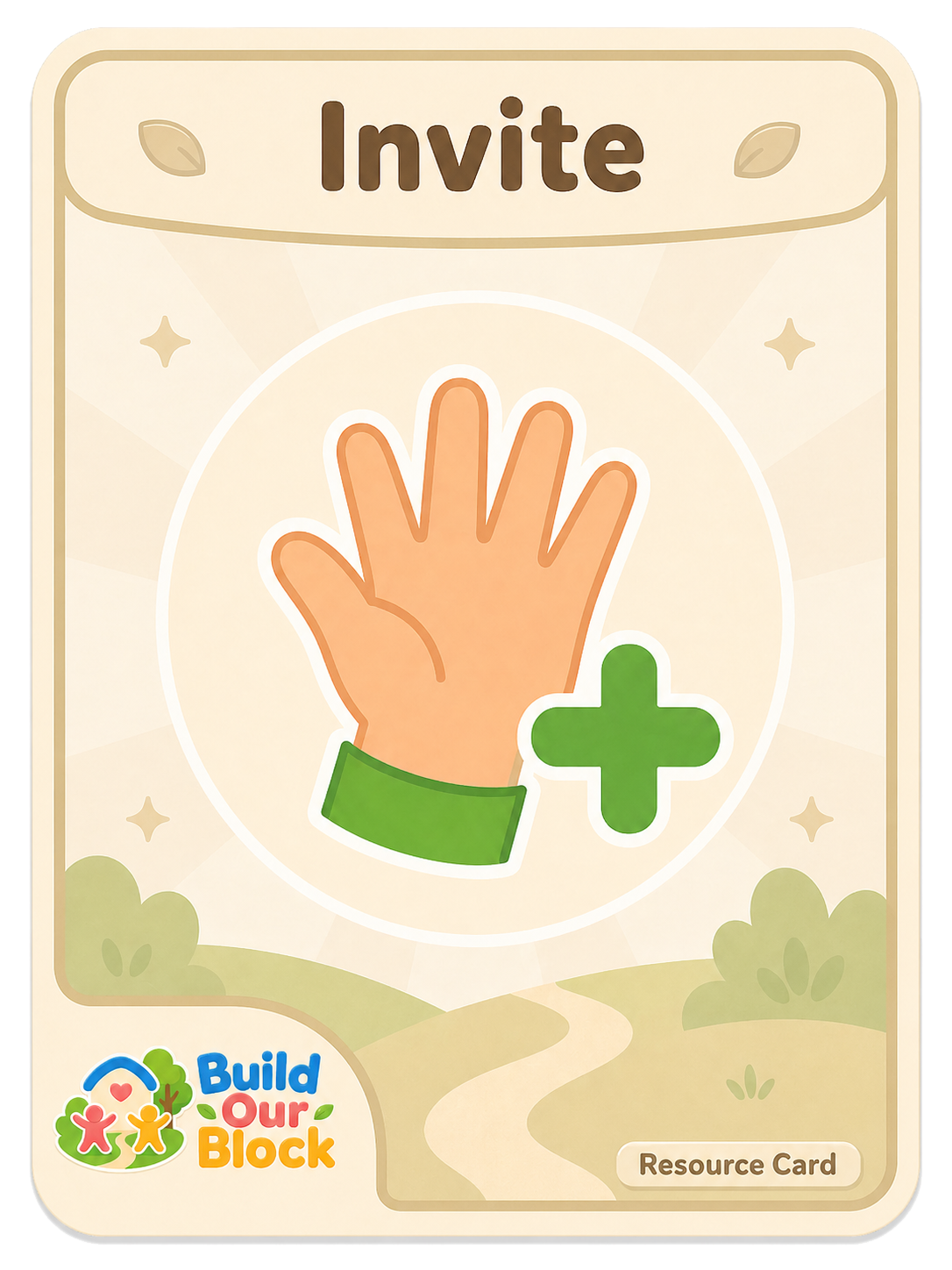
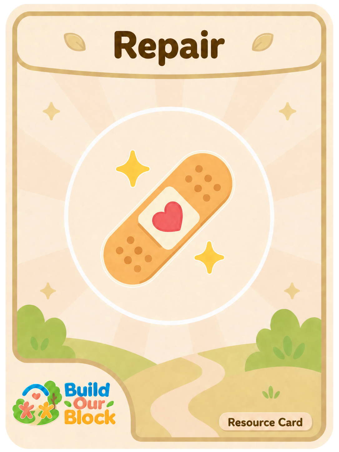
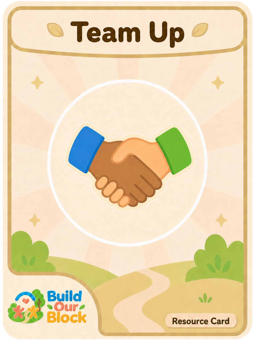
Each Challenge Card presents a short social scenario set in one of the six locations. Players read the story, choose Resource Card(s) from their hands, and explain how those actions would help solve the situation. The cards shown here are samples—the full game includes more scenarios across all six locations. There are two types:
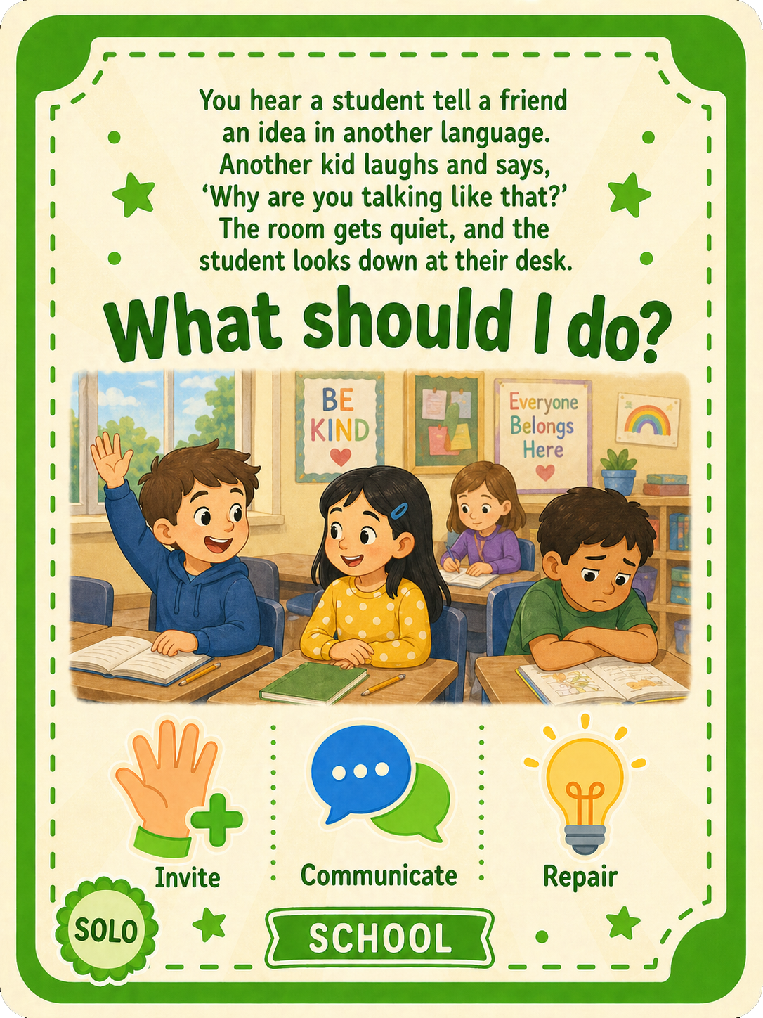
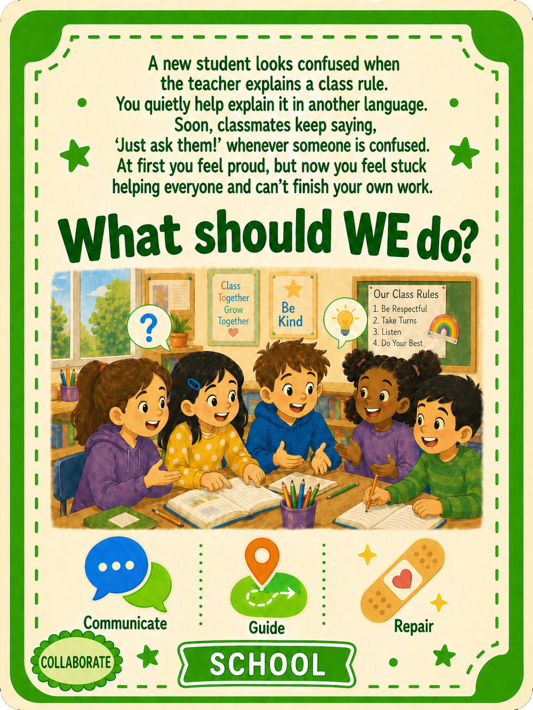
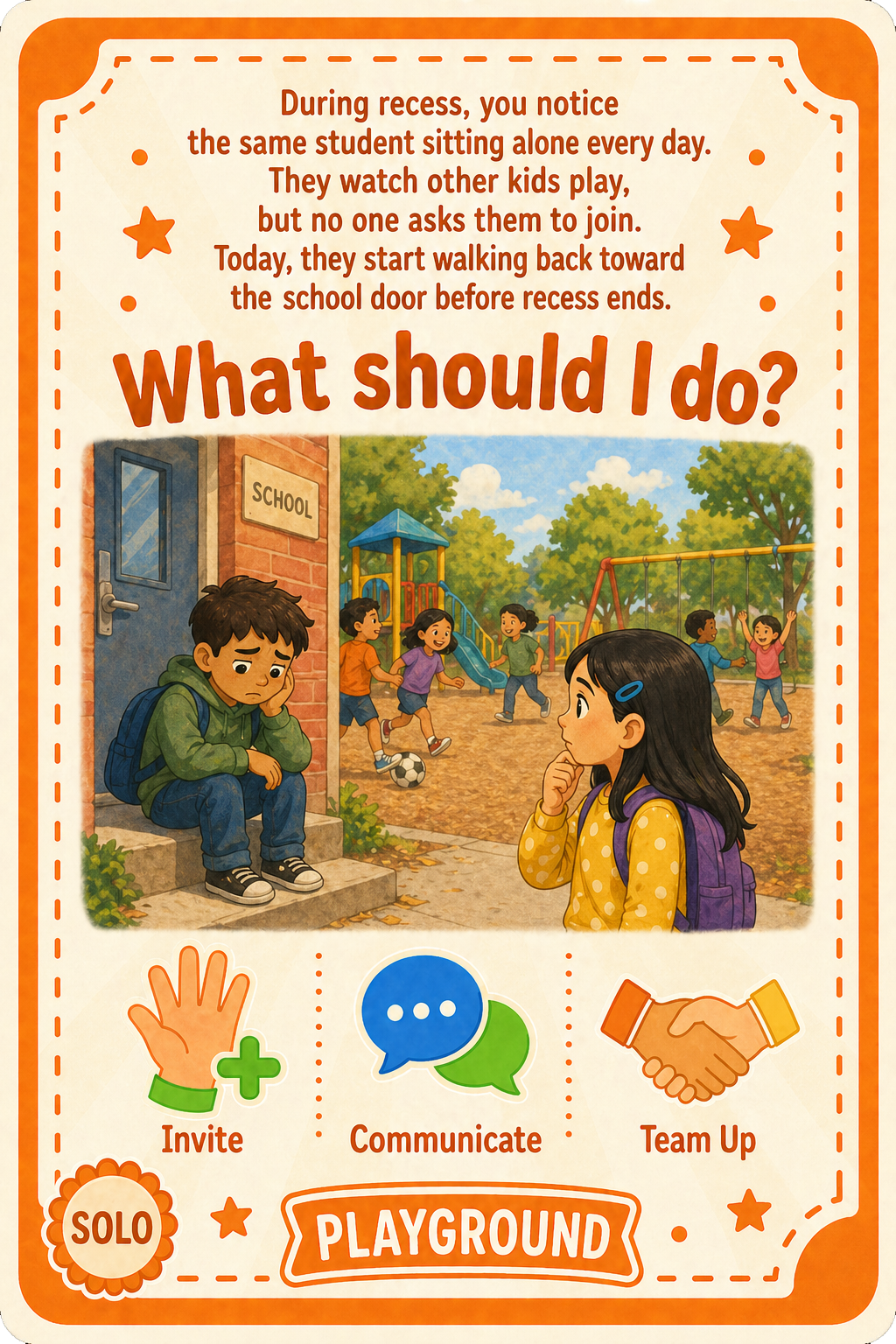
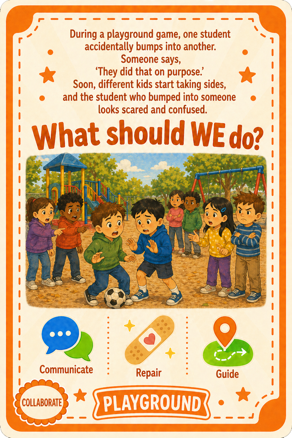
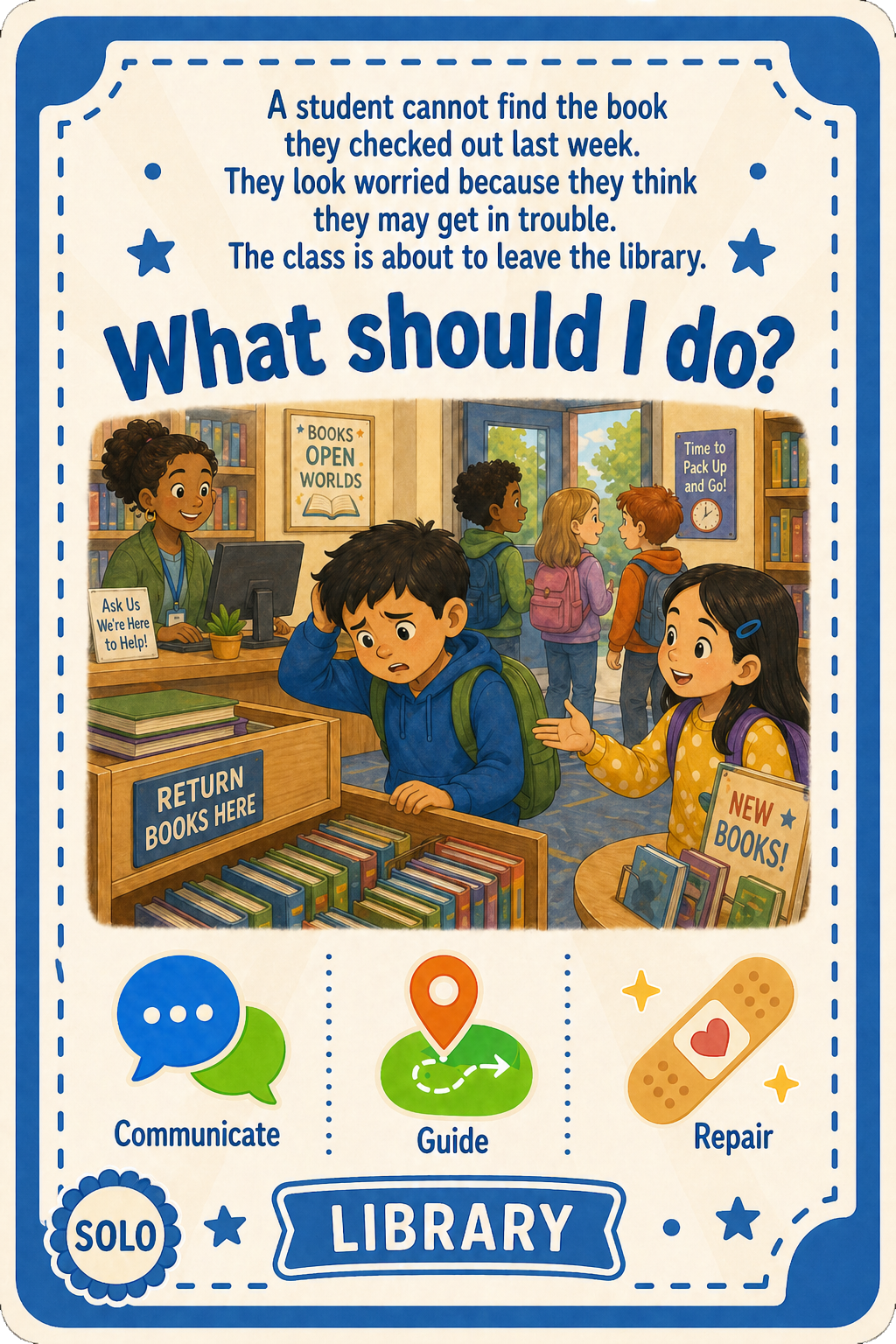
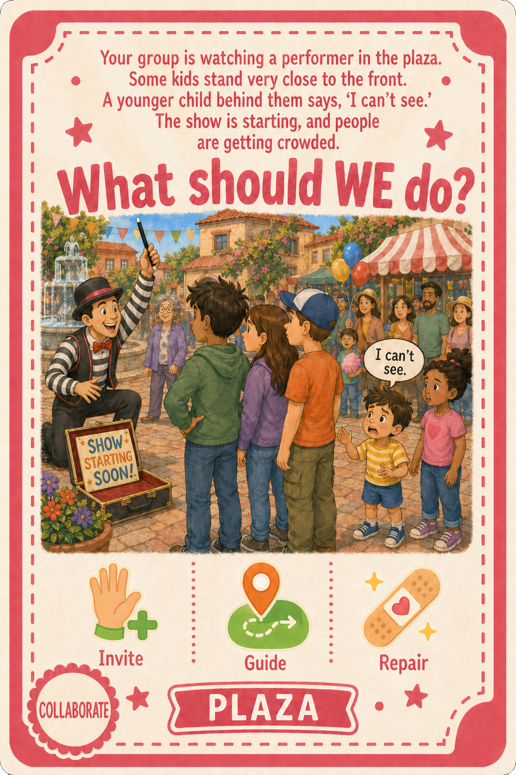
School — Solo & Cooperative Challenge Cards
All visual assets in this project—including the board, cards, facilities, icons, and the demo play scenes below—were generated using AI (ChatGPT Image 2.0) based on my descriptions, sketches, and previous illustration work as style references. The characters shown are not real children.